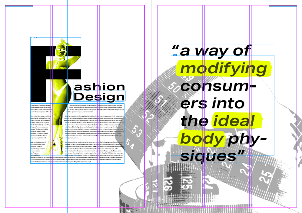
Editorial – Final Outcomes

Subject - Year 3, Uncategorised

Layout

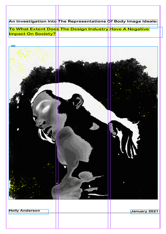
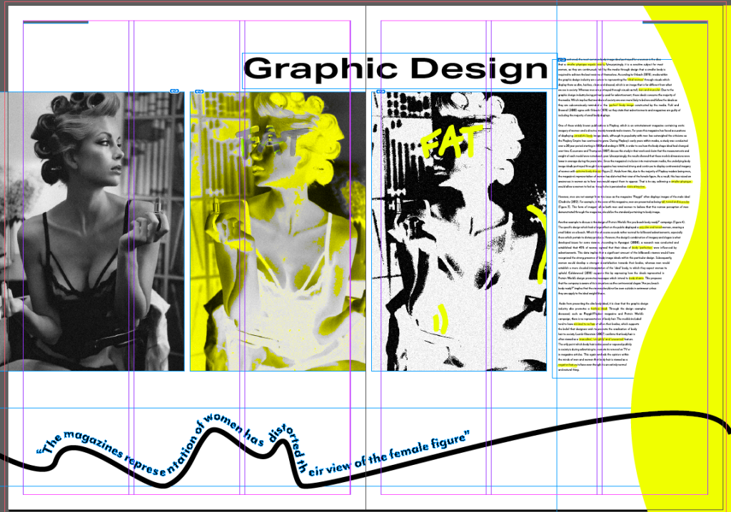
As you can see, for may editorial’s layout, I have tried to create a dynamic variety in the text’s structure and placement of imagery. Each spread follows the 3 column guidelines, however I have tried to ensure that each page is vastly different from each other. I did not wasn’t to repeat any particular style of layout in order to create a more interesting outcome. I believe I have achieved this as my designs are very experimental and demonstrate creative freedom.

Although I followed the 3 column guidelines, I still wanted to take risks within the design’s layout. I did this in order to demonstrate the key themes within my dissertation such as chaos, stress and manipulation.

The Visual Identity

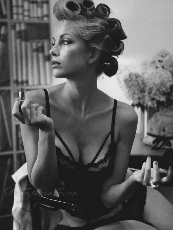
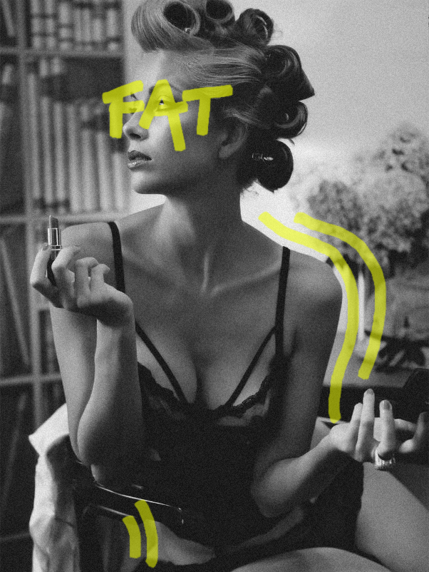
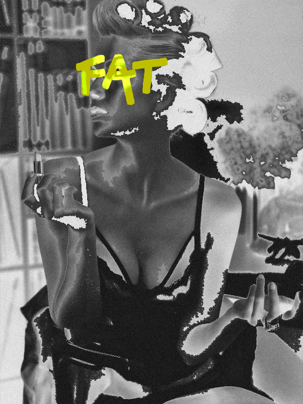
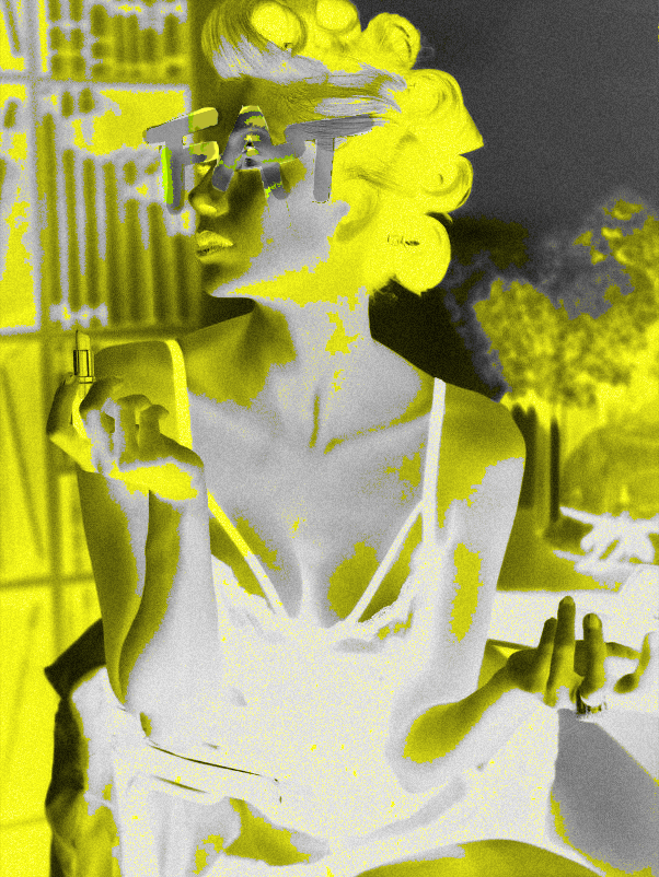
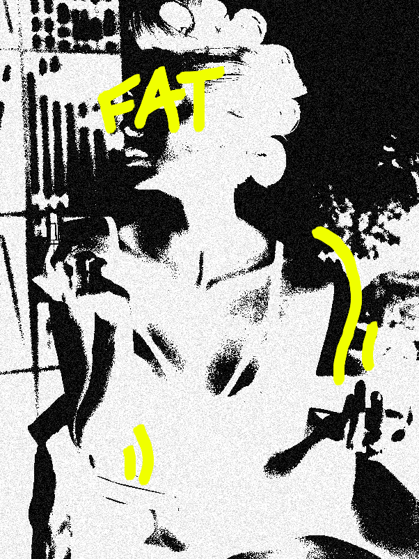
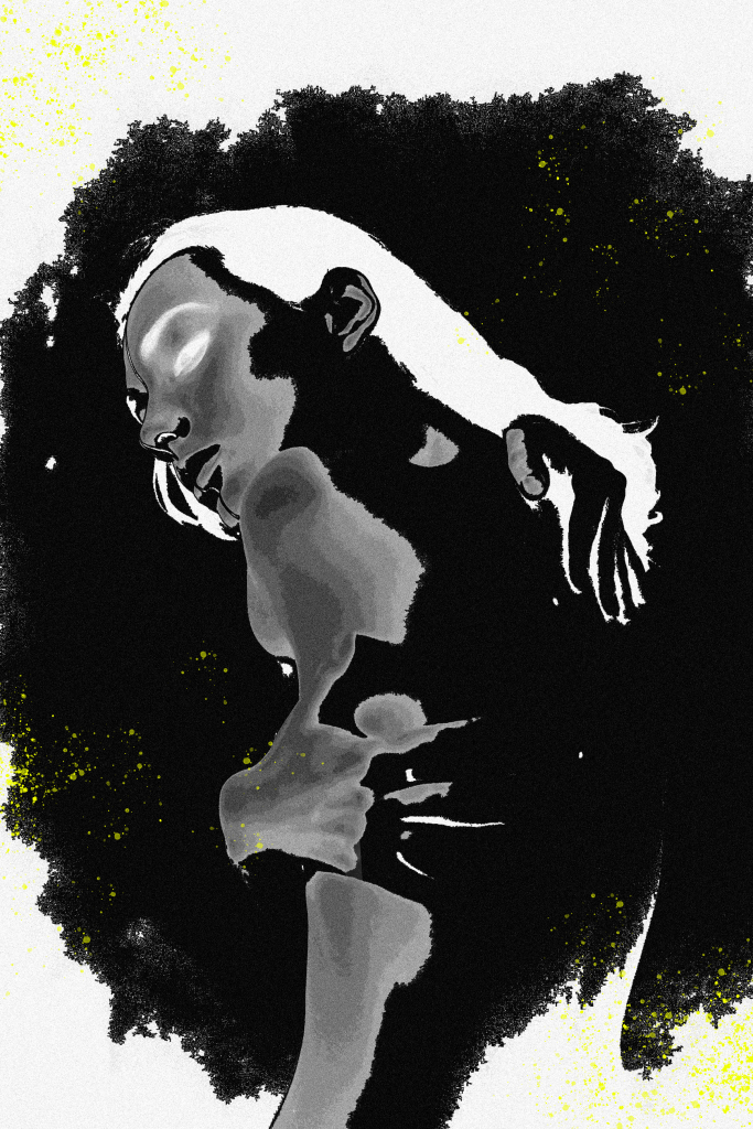
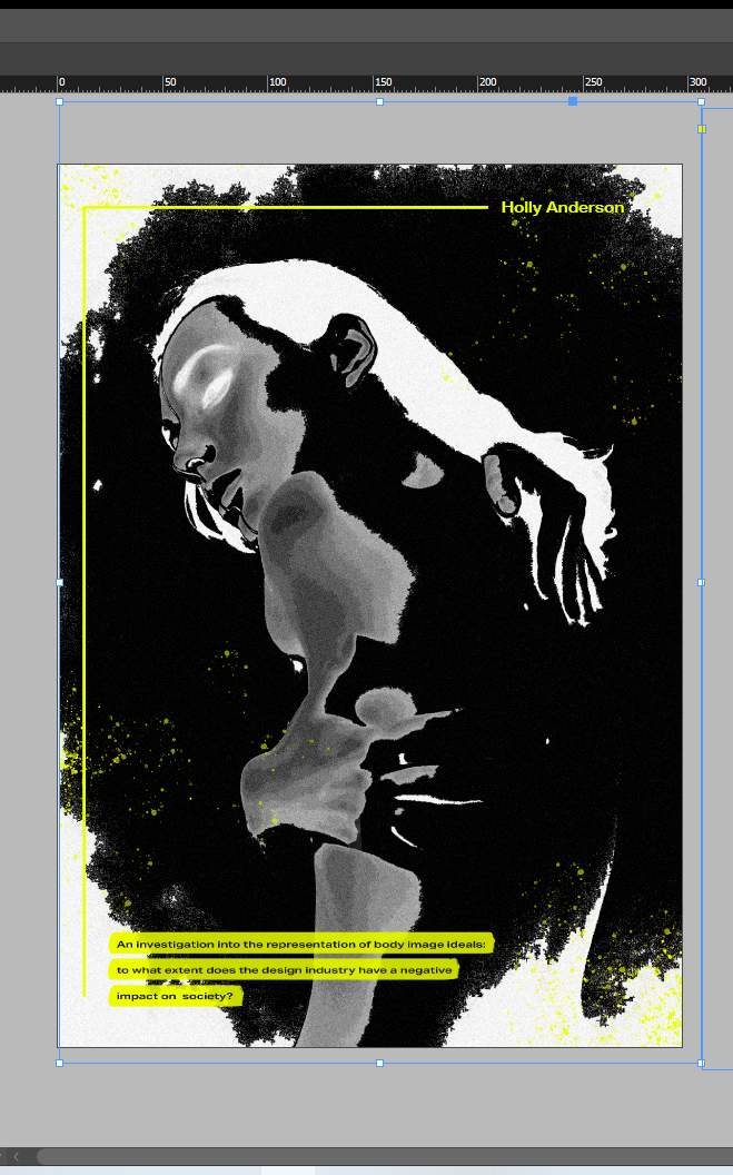
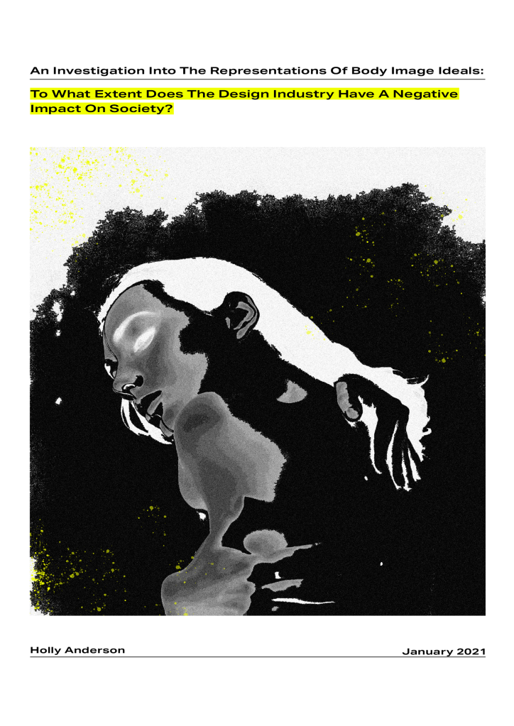
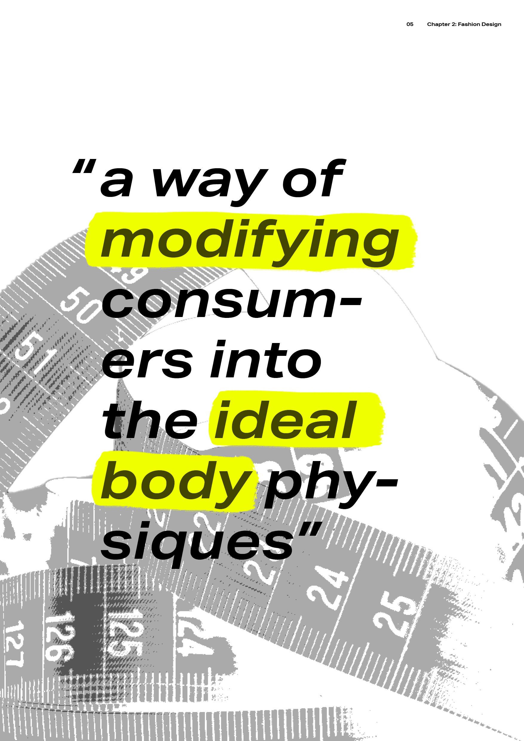
The visual identity of my editorial consisted of a variety of elements. For instance, in order to represent how the design industry draws attention to body image ideals, I incorporated ‘highlight’ effects to appear as though someone reading has highlighted words/images themselves. In addition, this allows the design to achieve a more personal feel, which I wanted to convey due to the fac that body image ideals has affected almost every individual in a personal way. To further push this idea, I also included hand-drawn text/visuals within many of the spreads. This effect also adds to the stress and pressure this issue causes on society, as many of the hand-drawn elements are messy and unstructured.

Other elements I included was curved imagery and shapes. The reader should notice that the body text is often manipulated to fit around curved imagery/shapes. Which is used as a nod to the design industry’s manipulation of society and how they view their bodies.

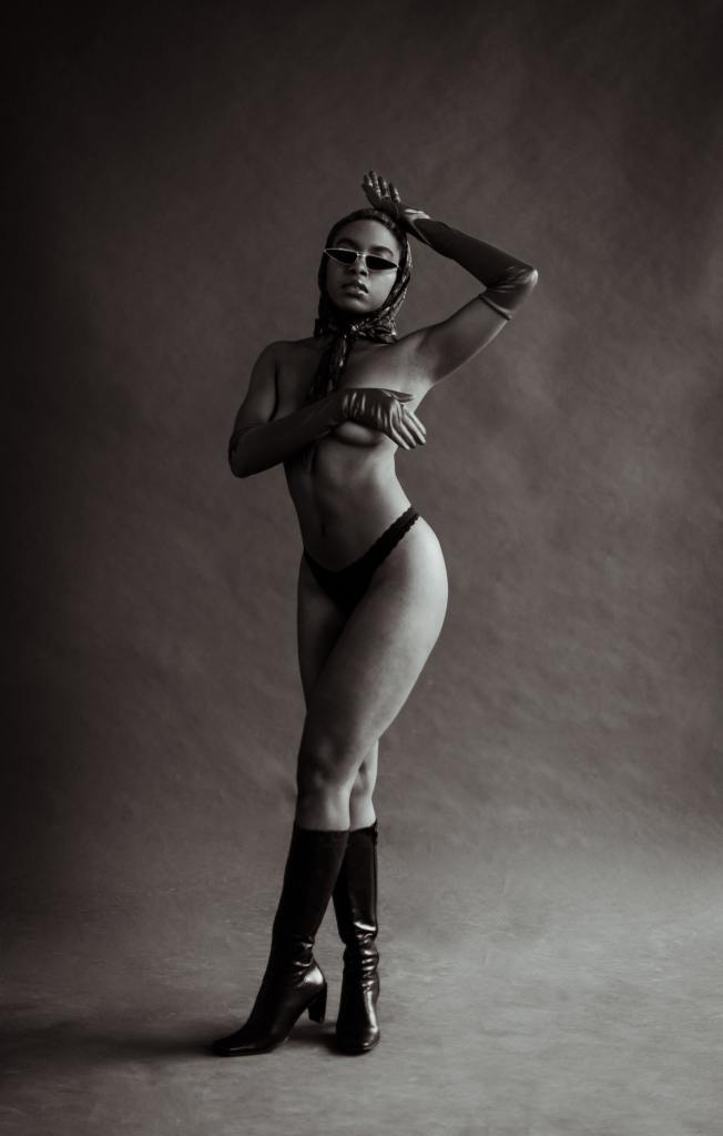
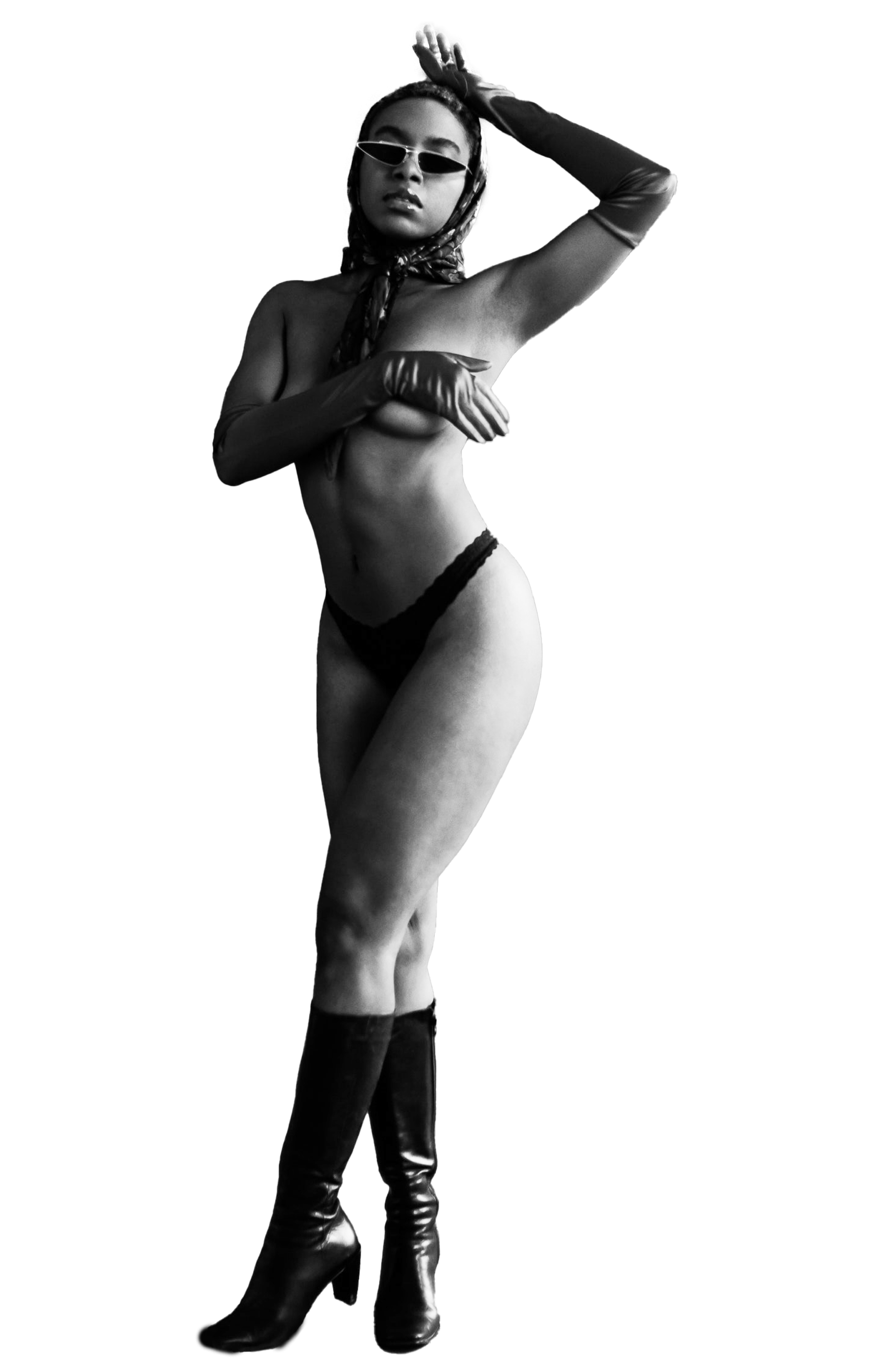
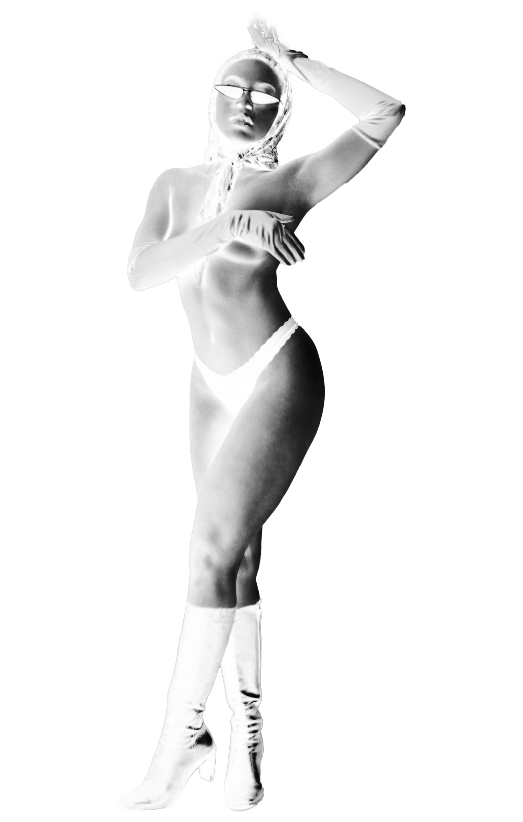
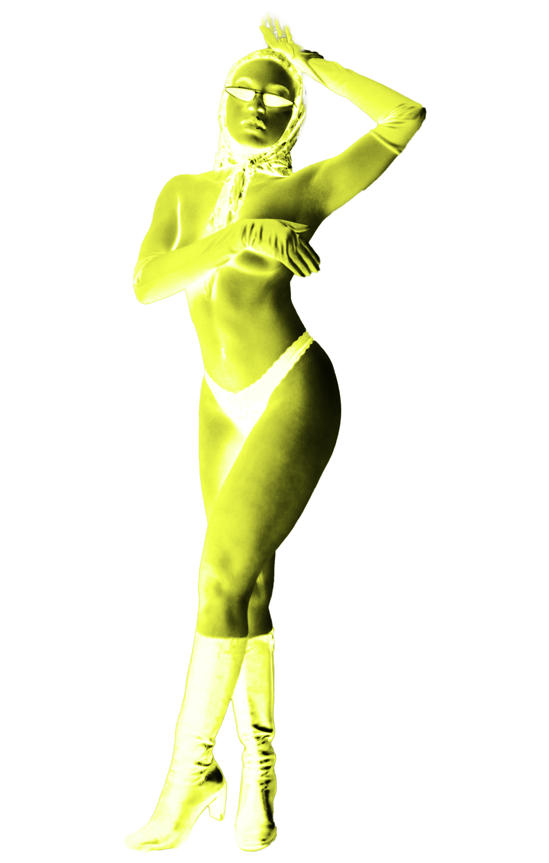
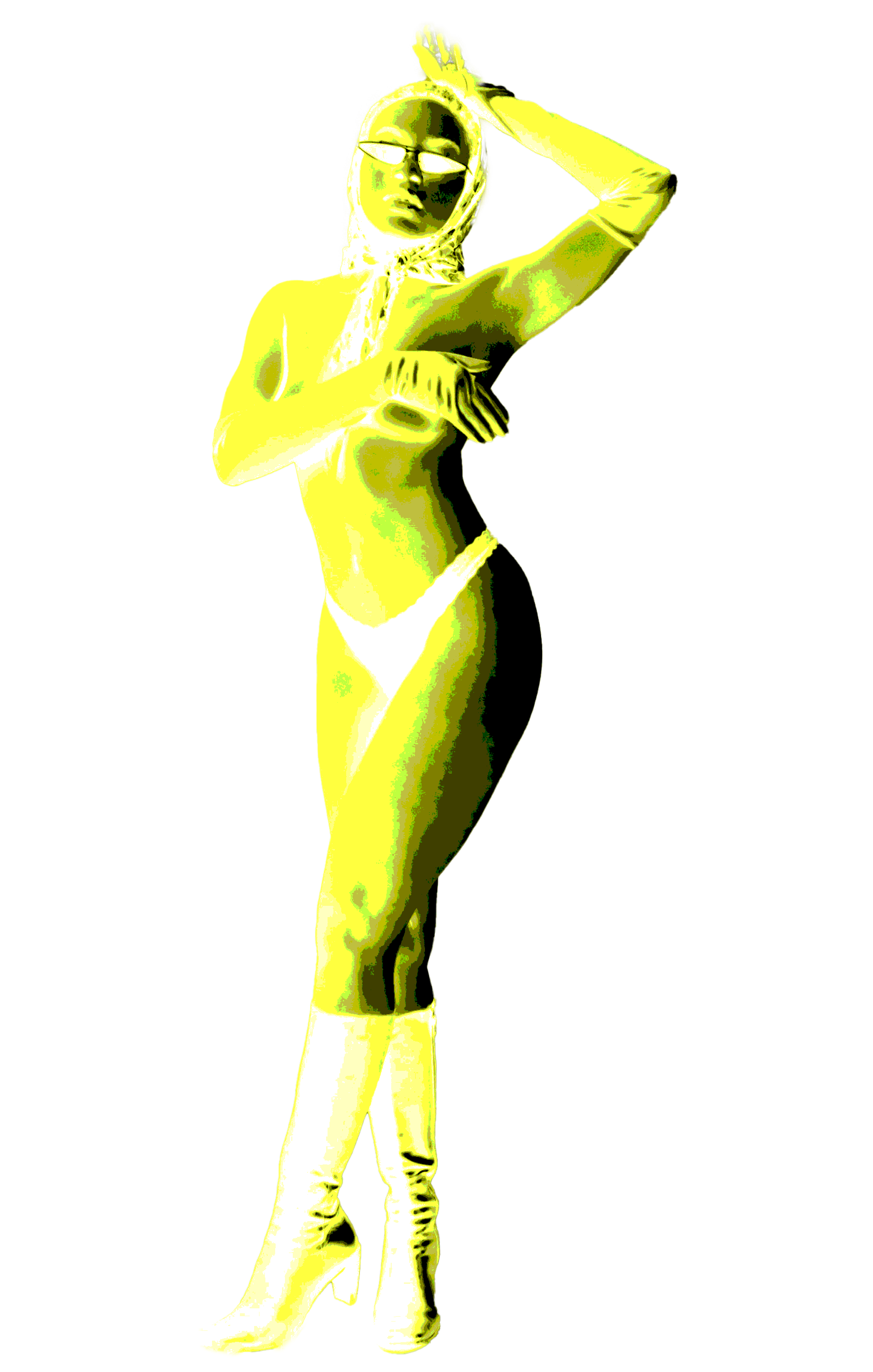
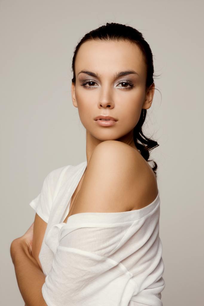
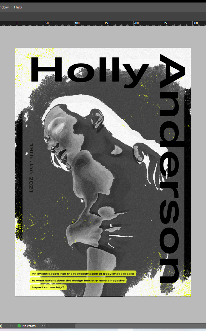
Finally, the primary imagery included are of slim bodied, hairless, barely clothed models. This design choice was made in order to replicate how the industry exploits the issue visually and often exacerbate it’s repercussions on society. Overall, my aim was not to covey a traditional, structured editorial, but it was to display the disorder and chaos the issue can cause.
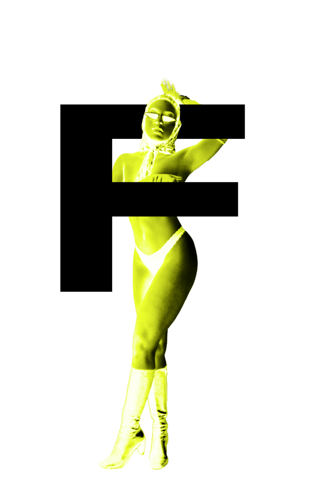
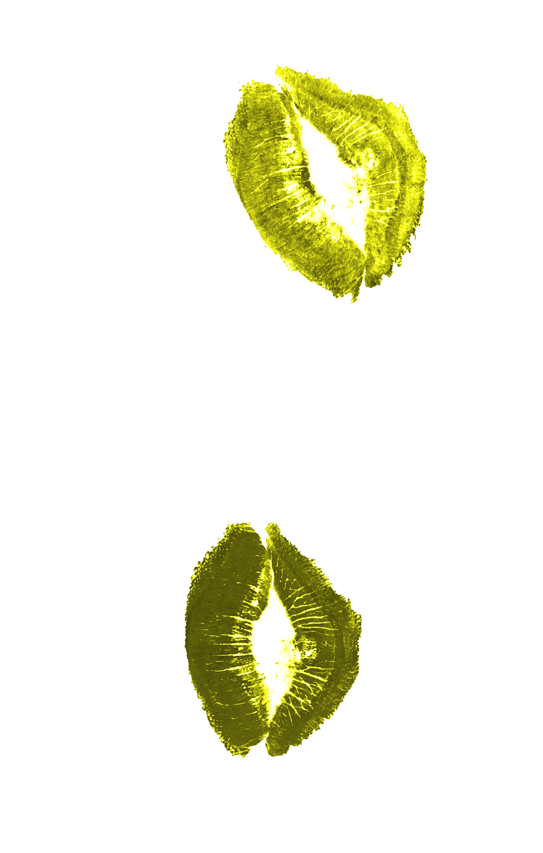
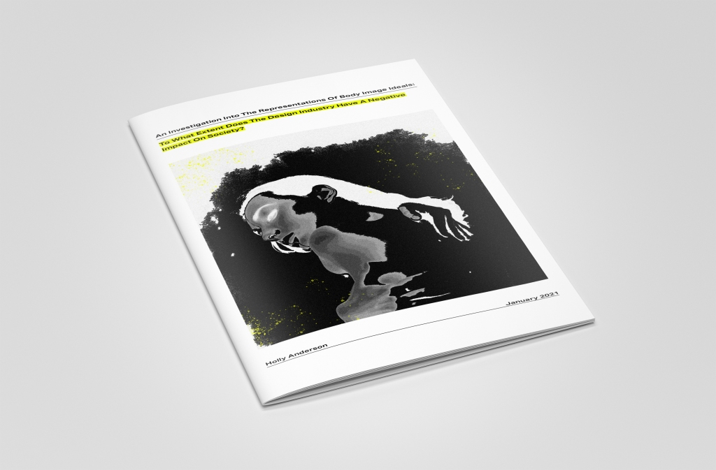
Front Cover:

Spread 1:

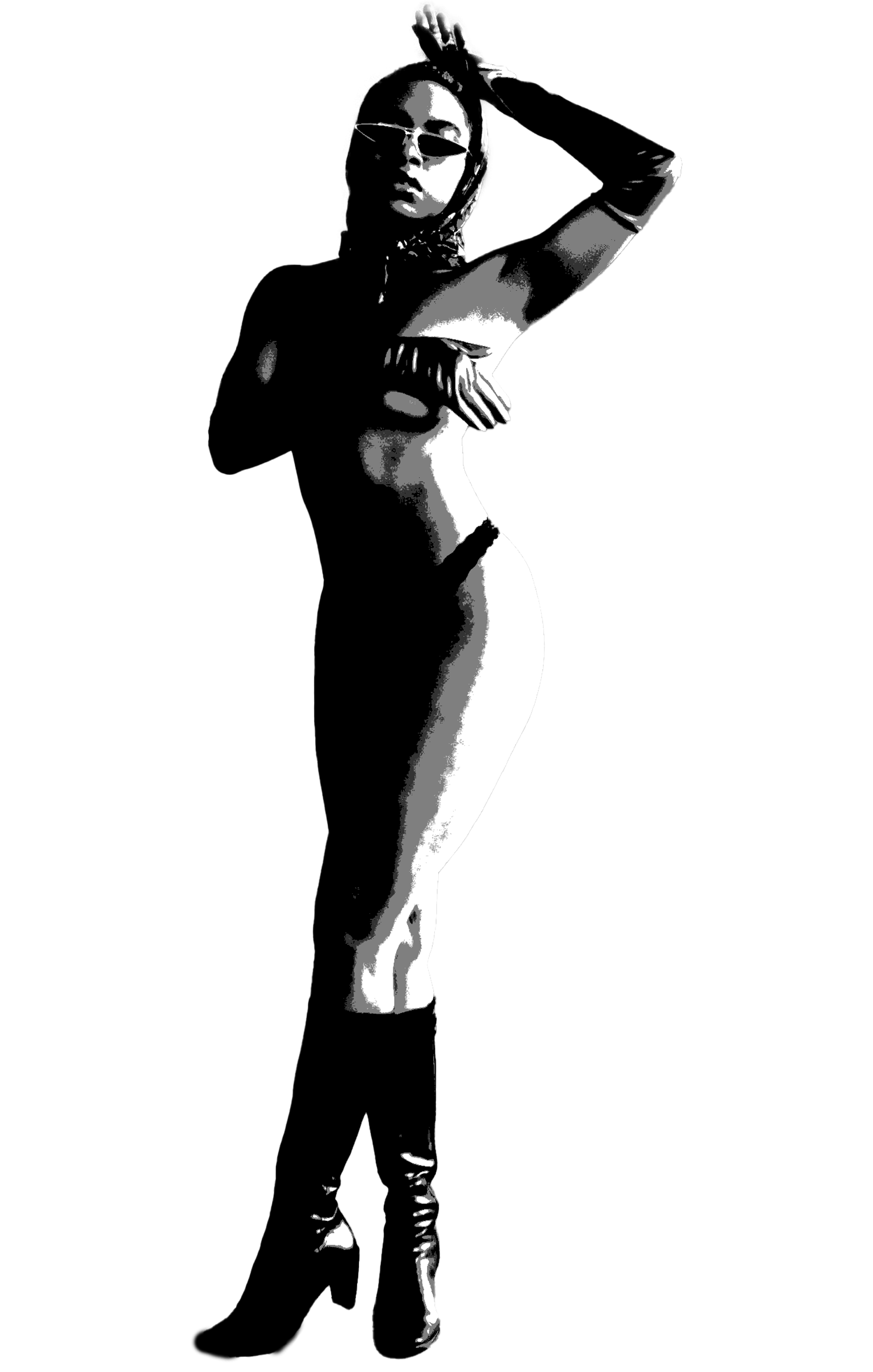
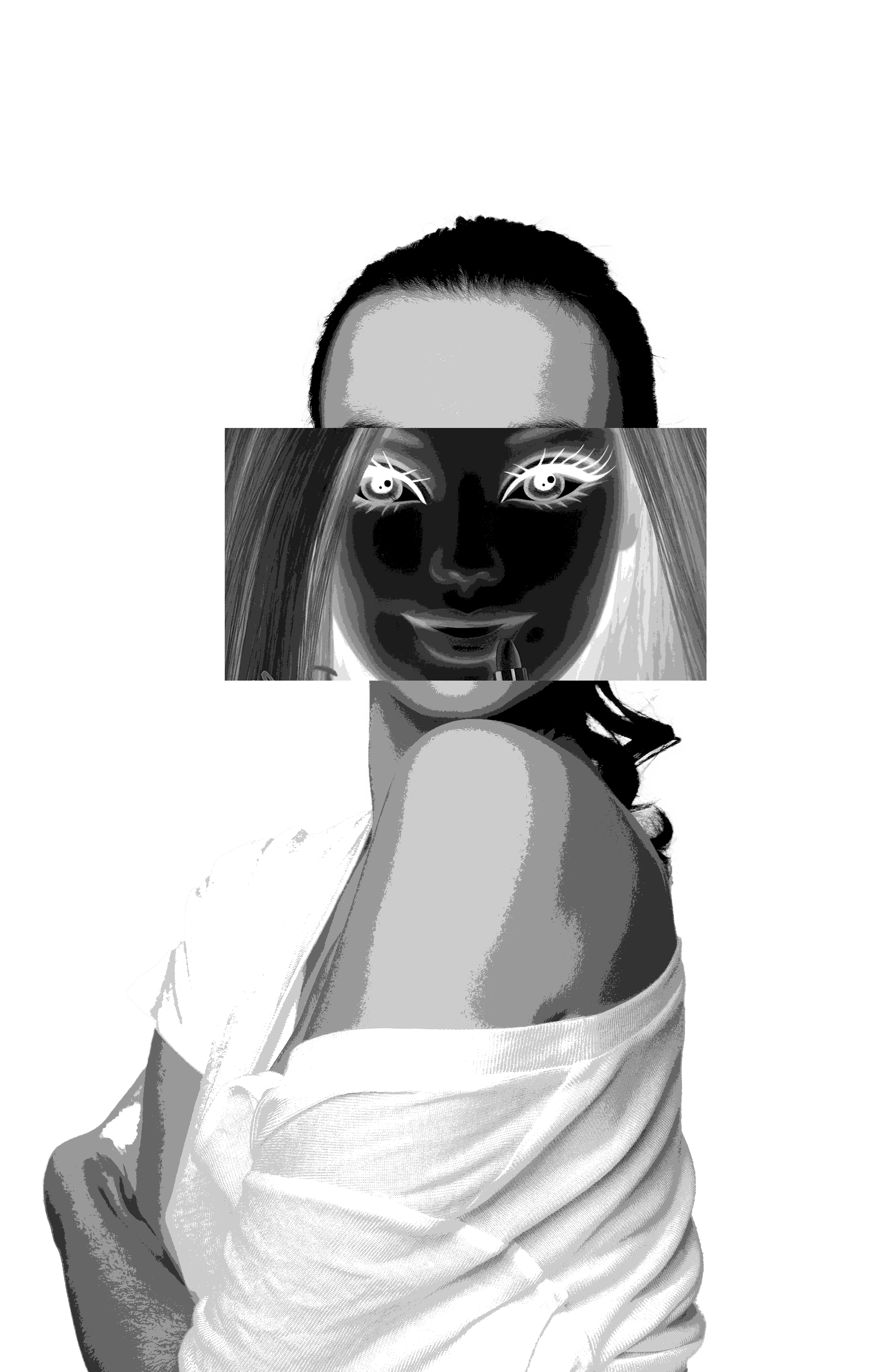
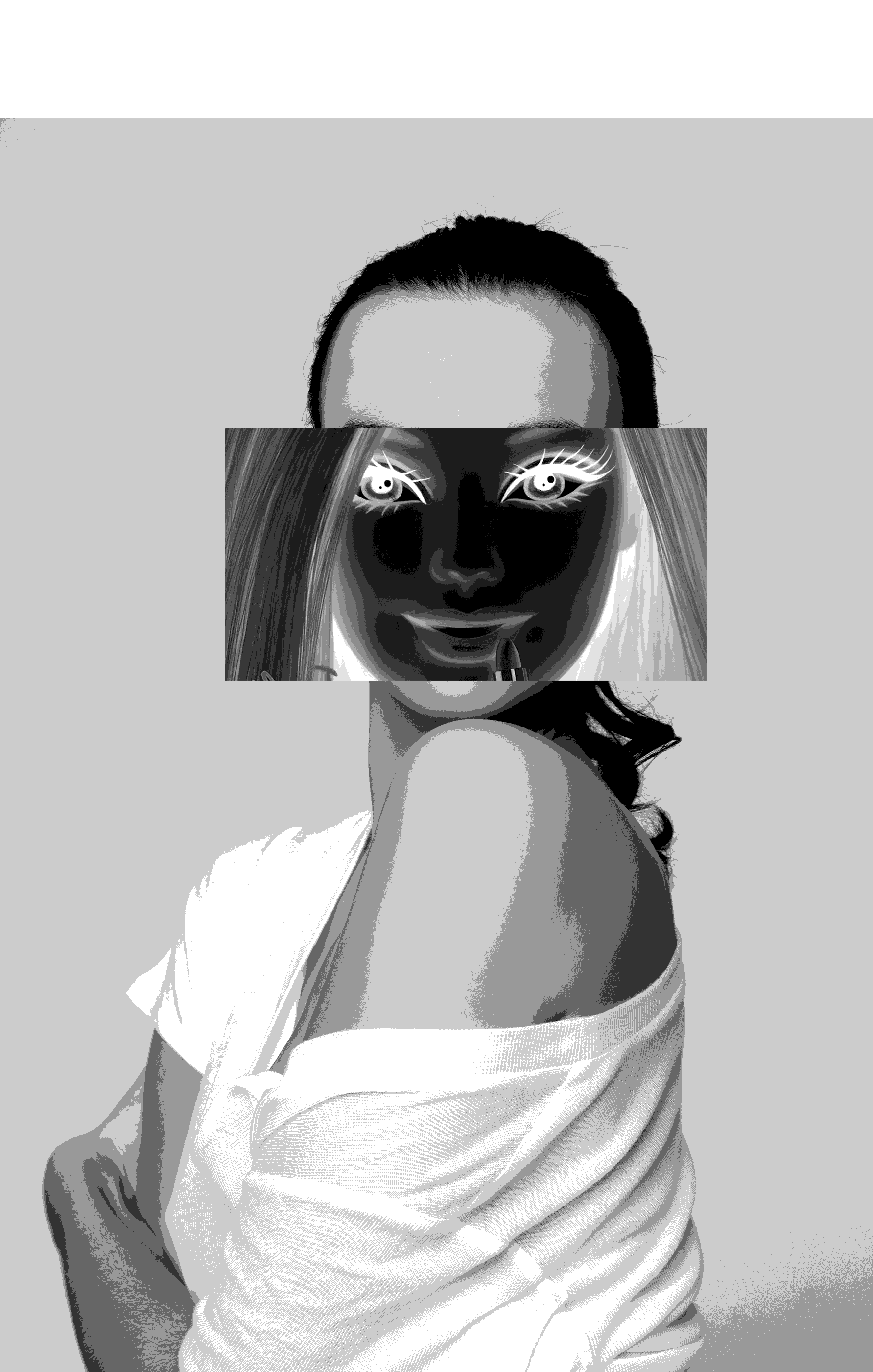
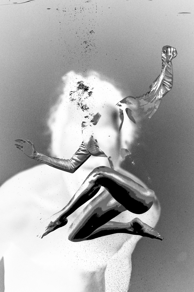
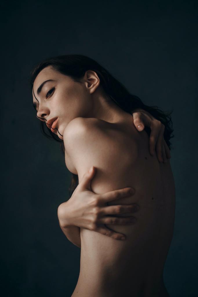
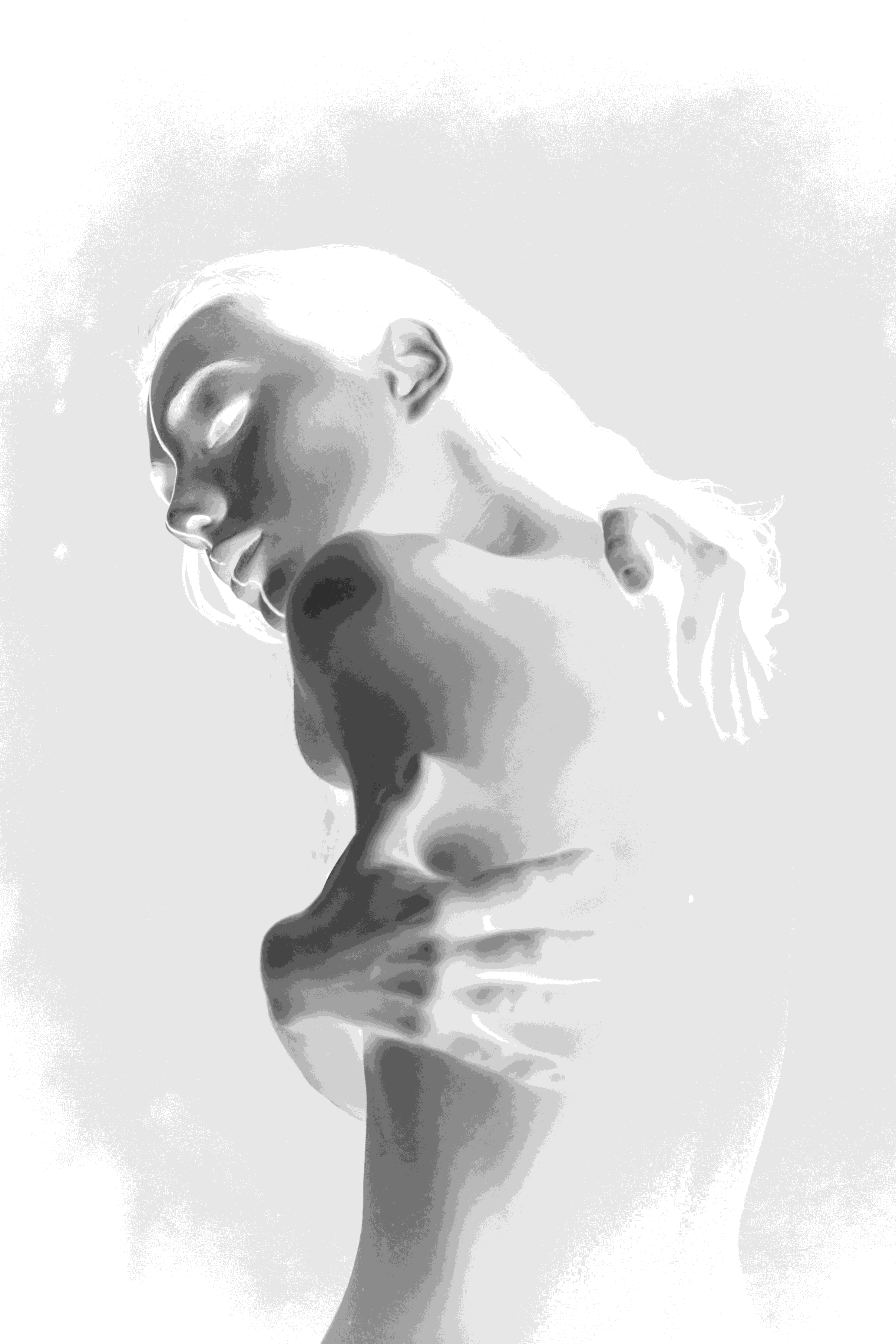
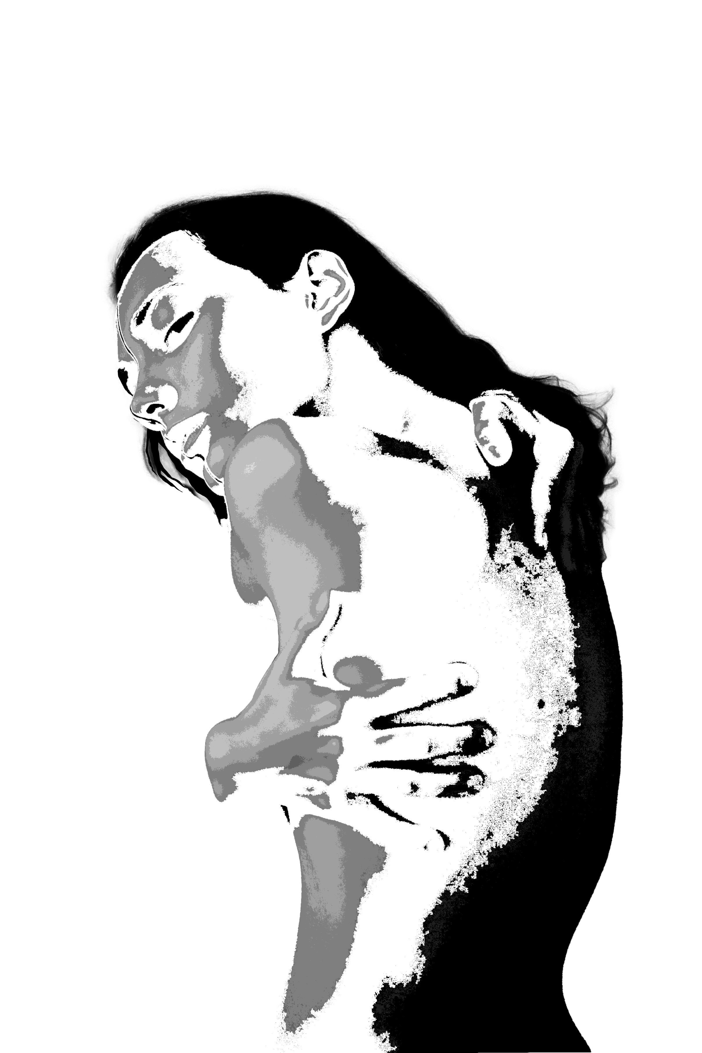
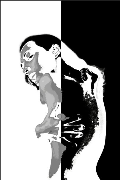
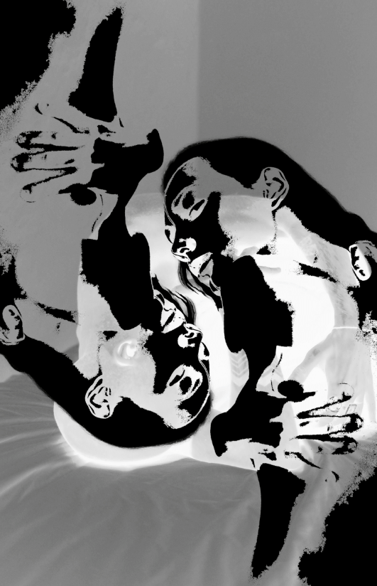
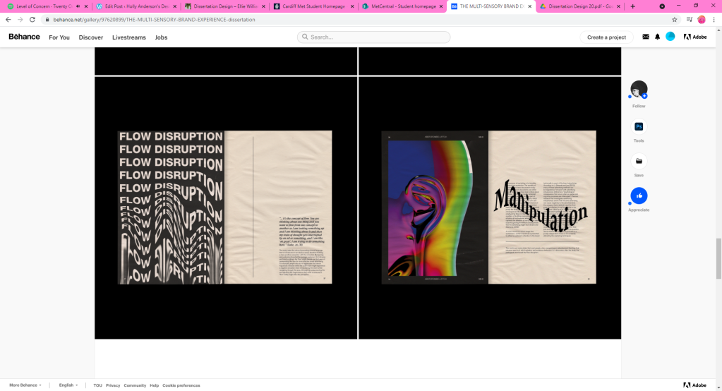
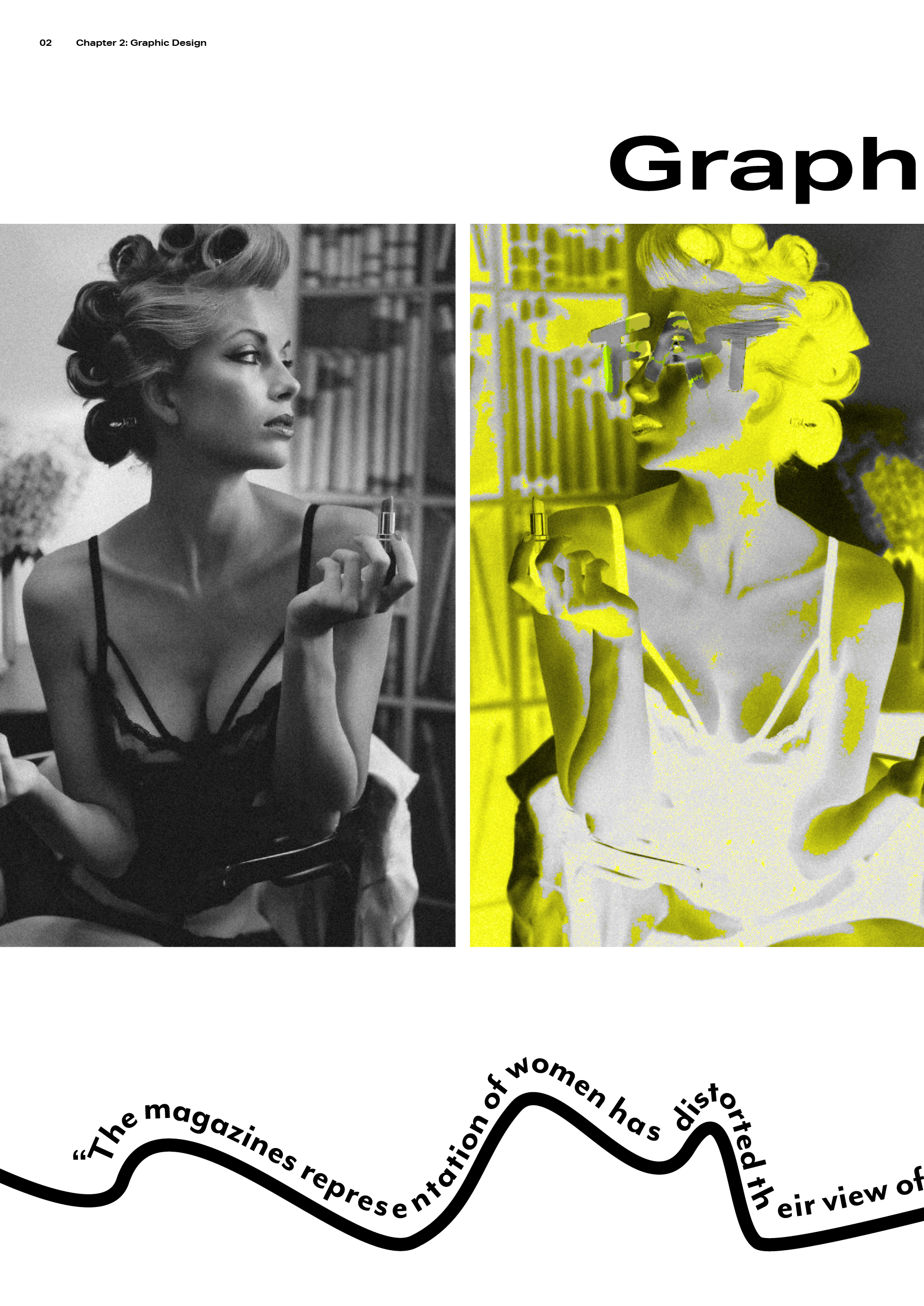
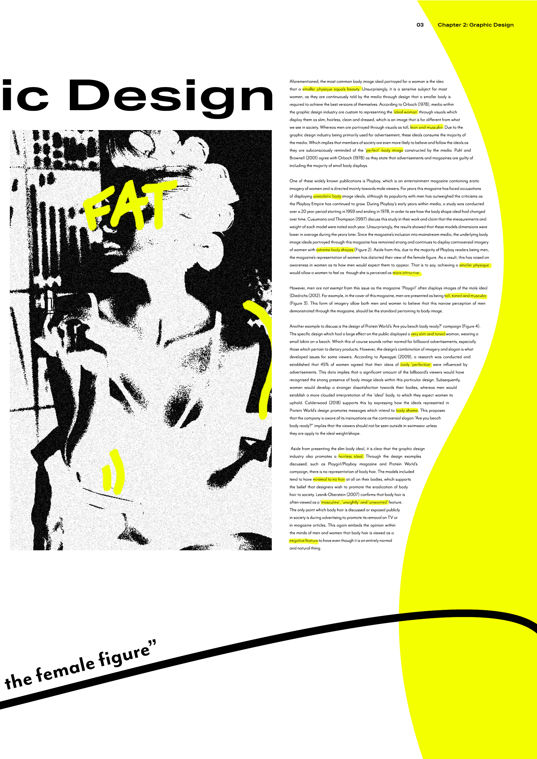
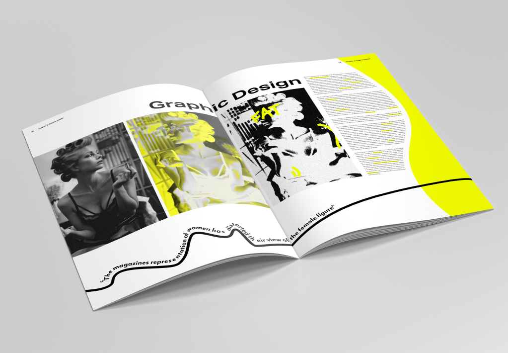
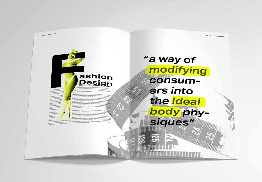
For this spread, I wanted the visuals to convey how graphic design can manipulate a person’s perception of their body. As you can see, the imagery of the woman represents this as she is looking back at the distorted versions of herself. This spread also plays with shapes and the female form through the curves within the text and flowing line. This line also includes a pull out quote which discusses distortion. I placed this visual and quoted together as they both link through the subject of distortion (as the line distorts the shape of the text).

Spread 2:

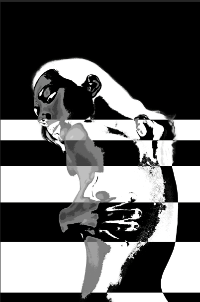
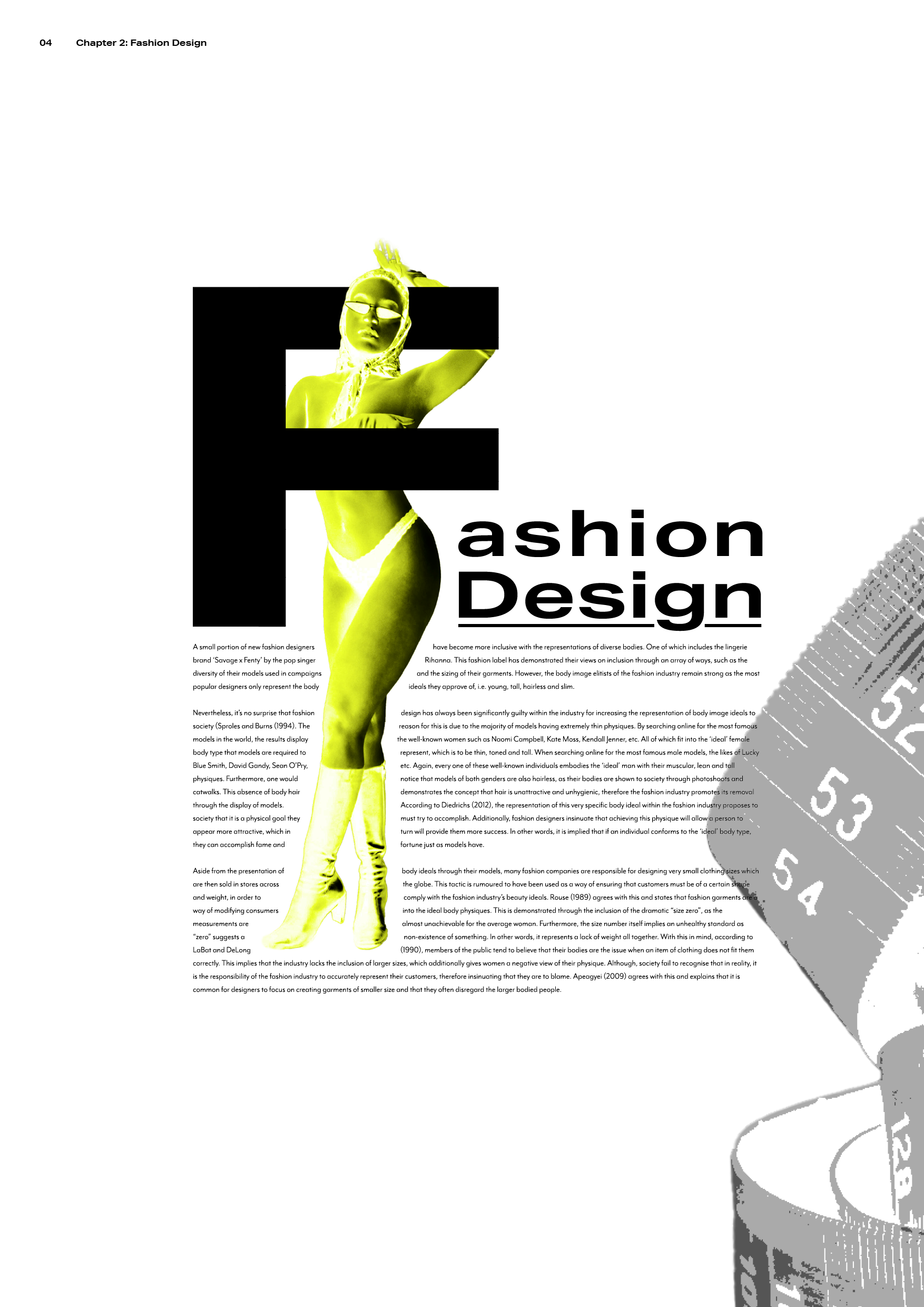
This spread demonstrates the relevance of body image ideals within fashion design as the unclothed model conveys how the industry exploits the insecurities of society. Additionally, the text follows the form of this models body, which insinuates that the fashion industry often manipulate the thoughts of others through their representations of the female body. Once again you will notice the inclusion of ‘highlight’ effects.

Spread 3:

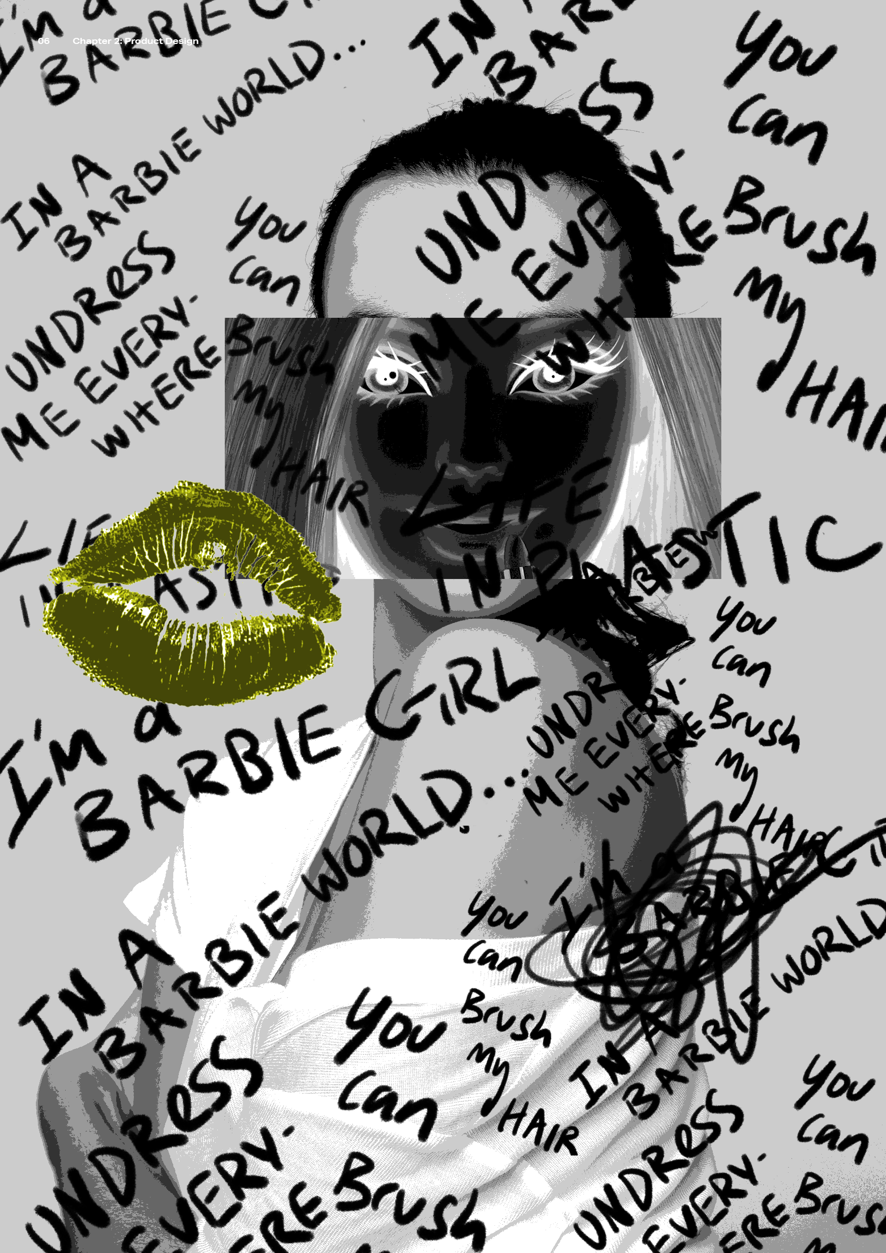
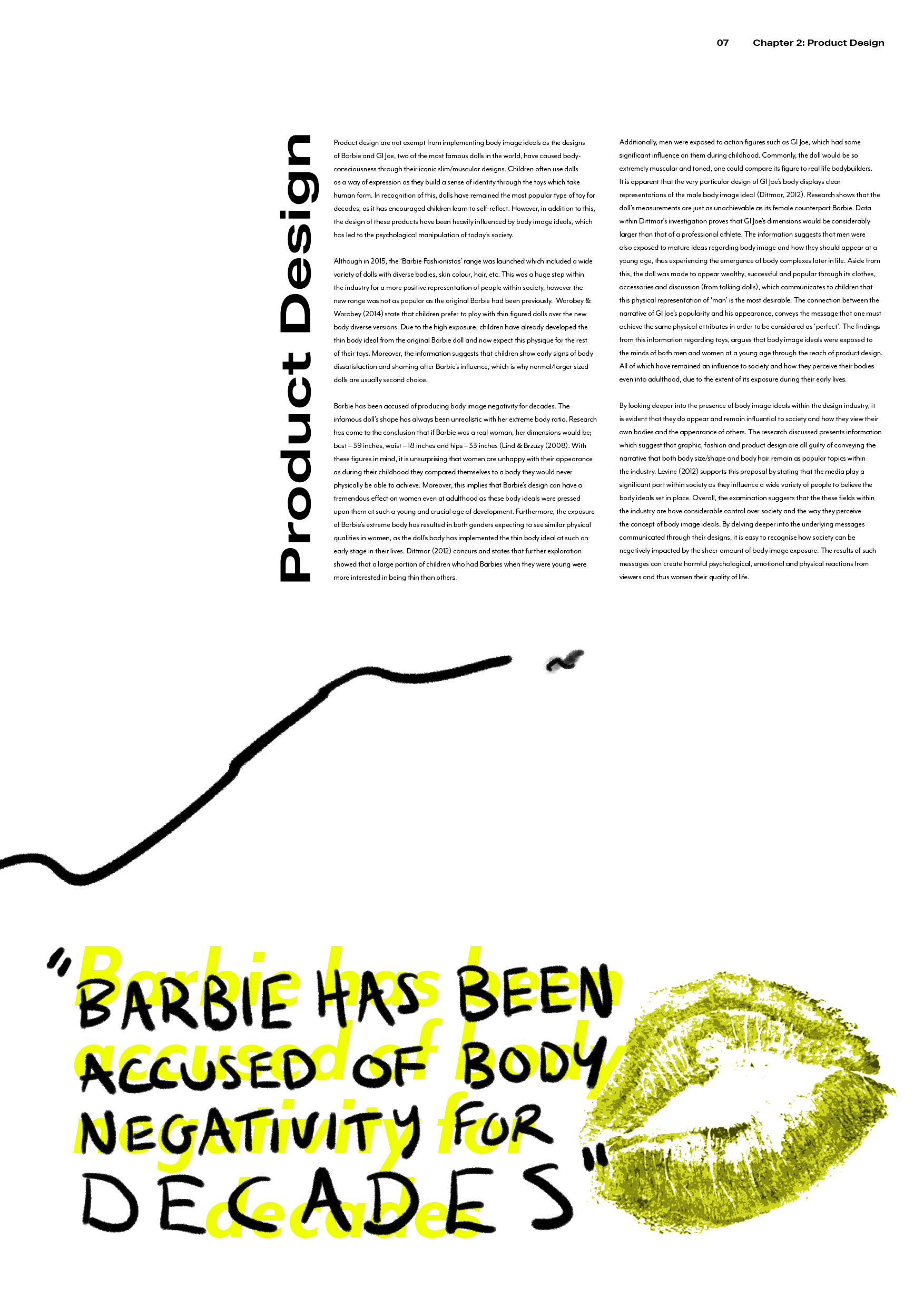
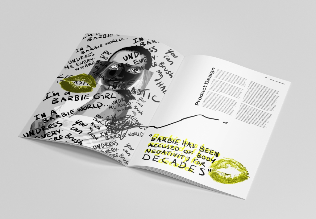
For this spread I focussed on how the product design industry convey body ideals through Barbie dolls. This page particularly displays stress as it demonstrates the pressure that Barbie’s appearance brings to young children. The text is placed in a box like shape as I wanted to not only represent Barbie’s product box, but also how society are forced to a hypothetical box of body image ideals.

Spread 4:

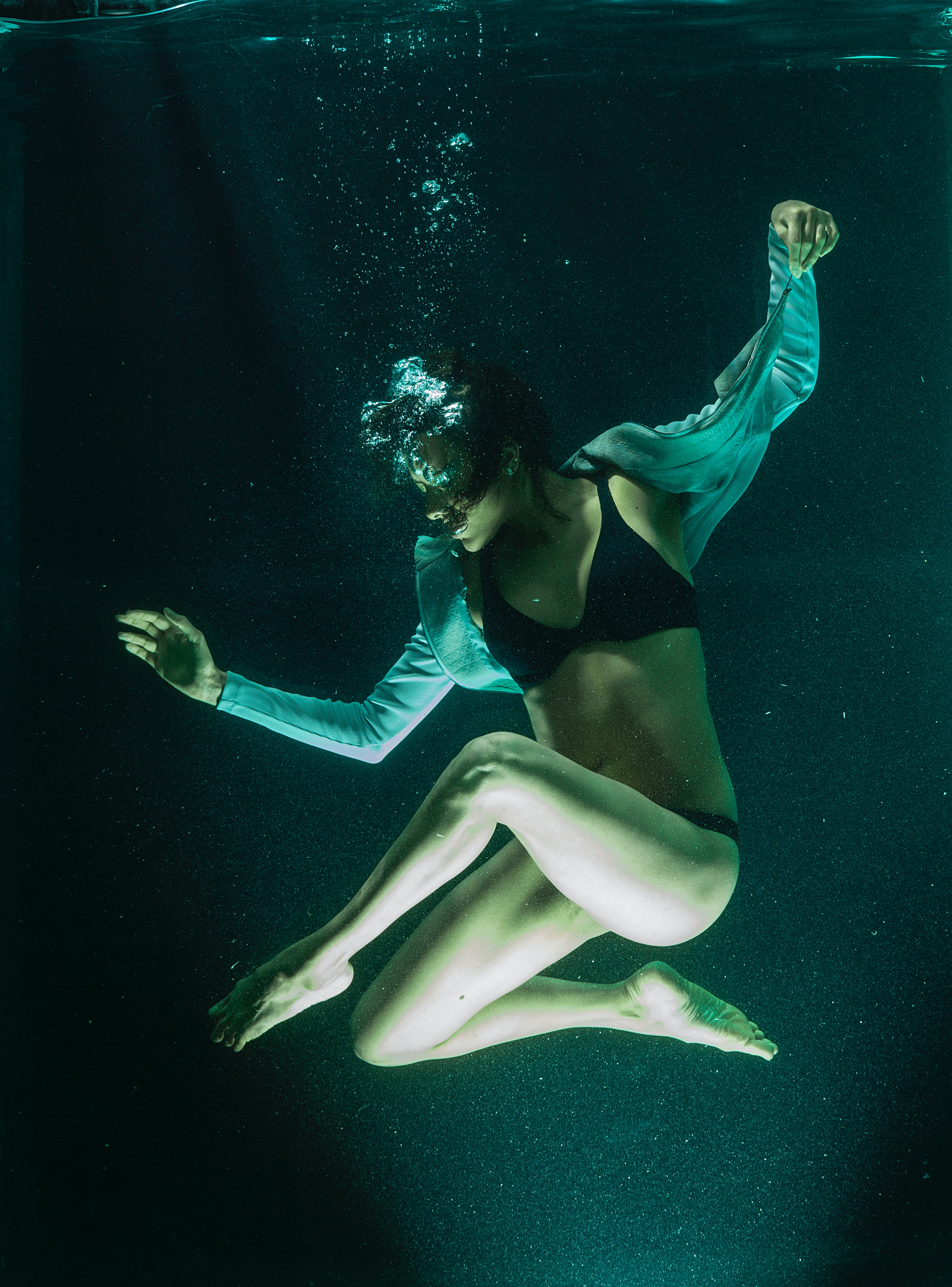
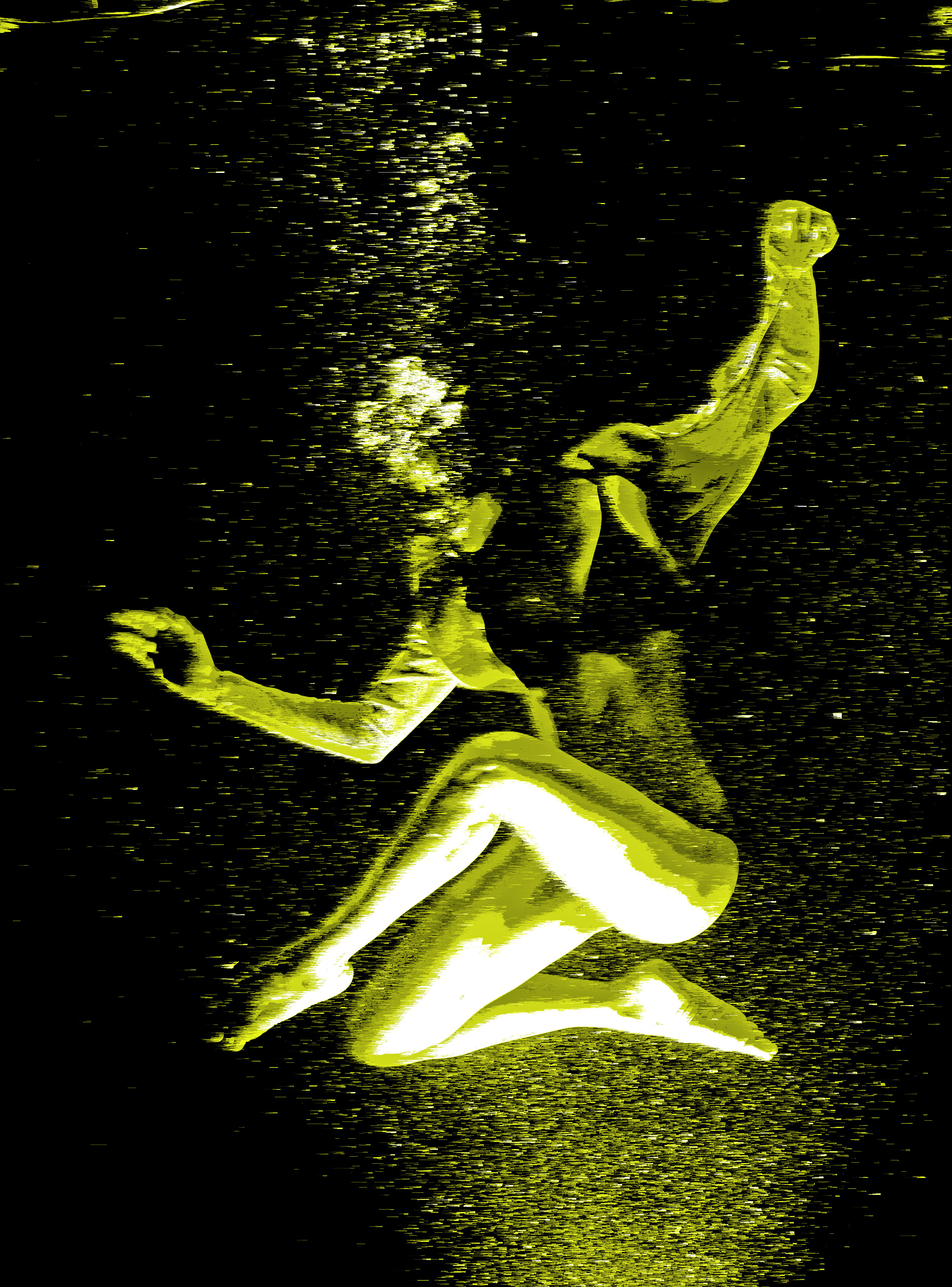
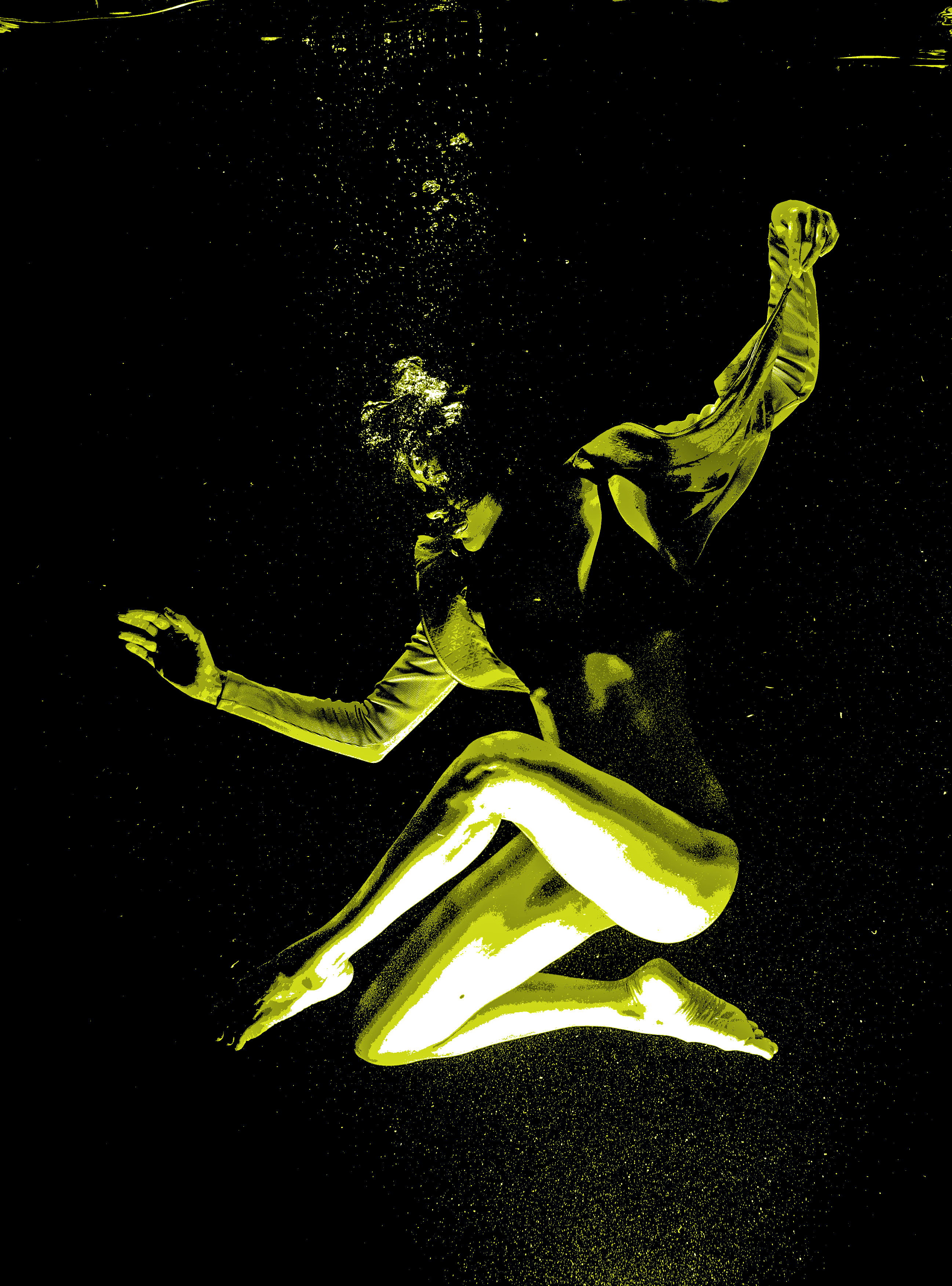
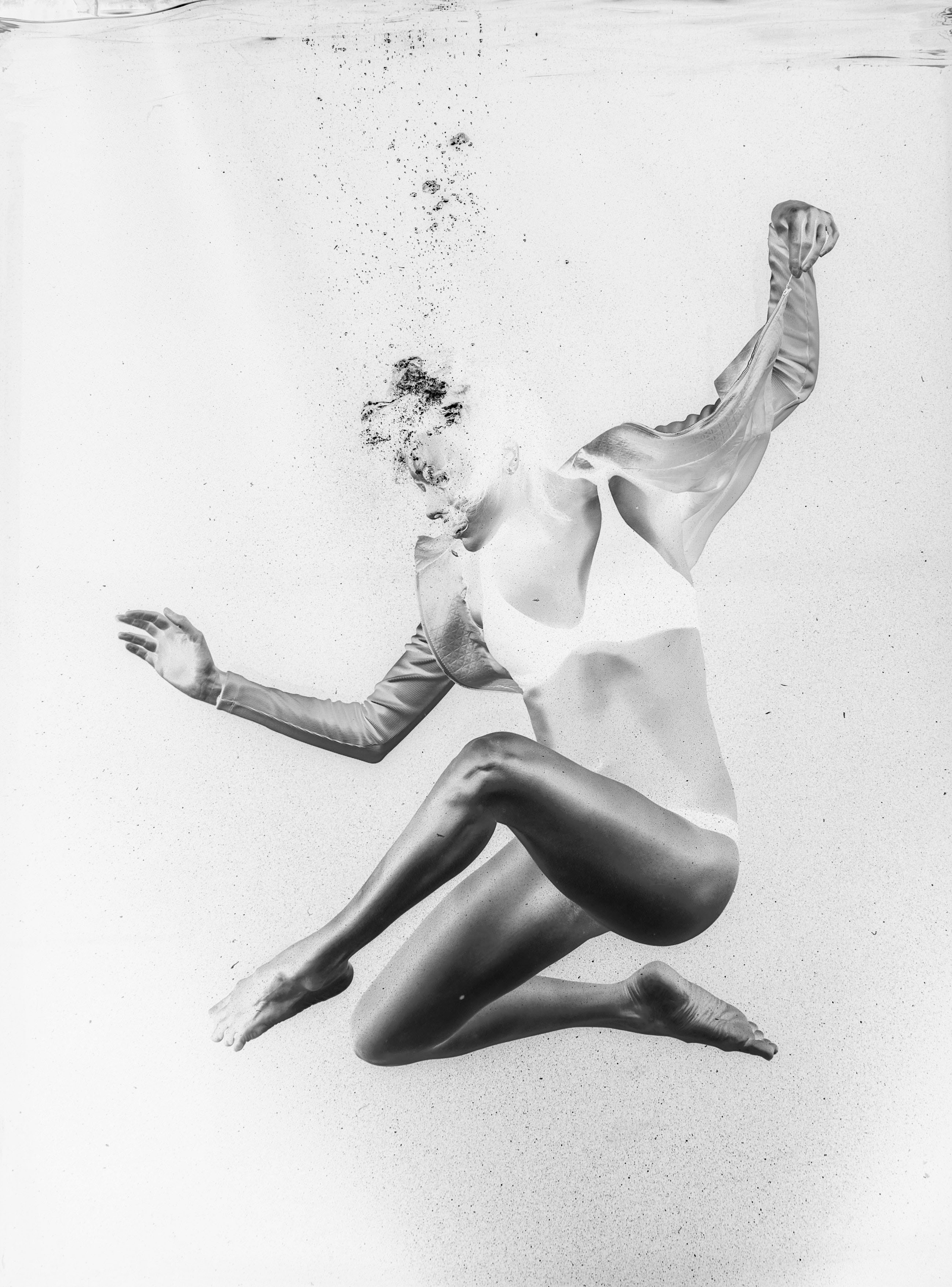
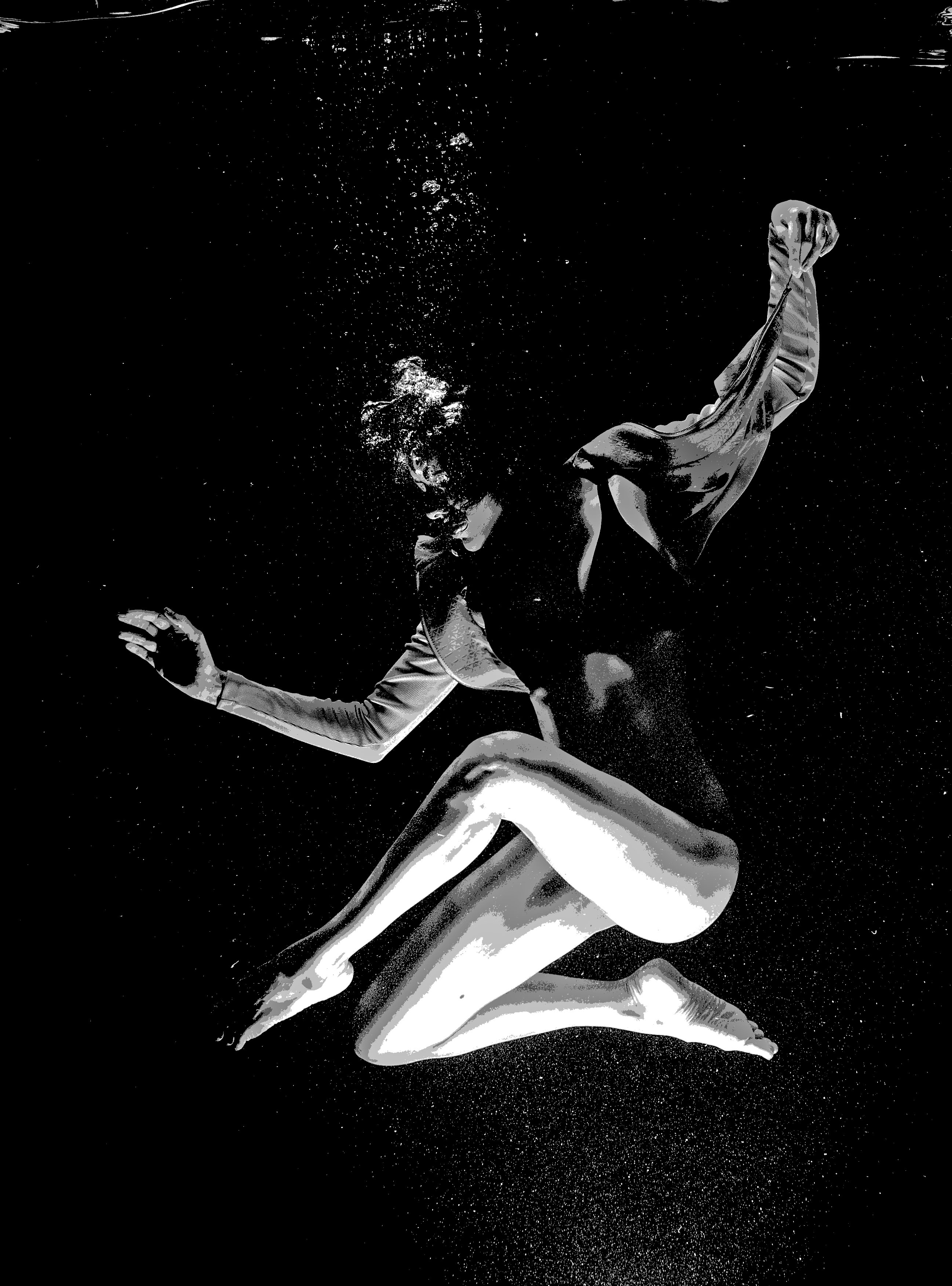
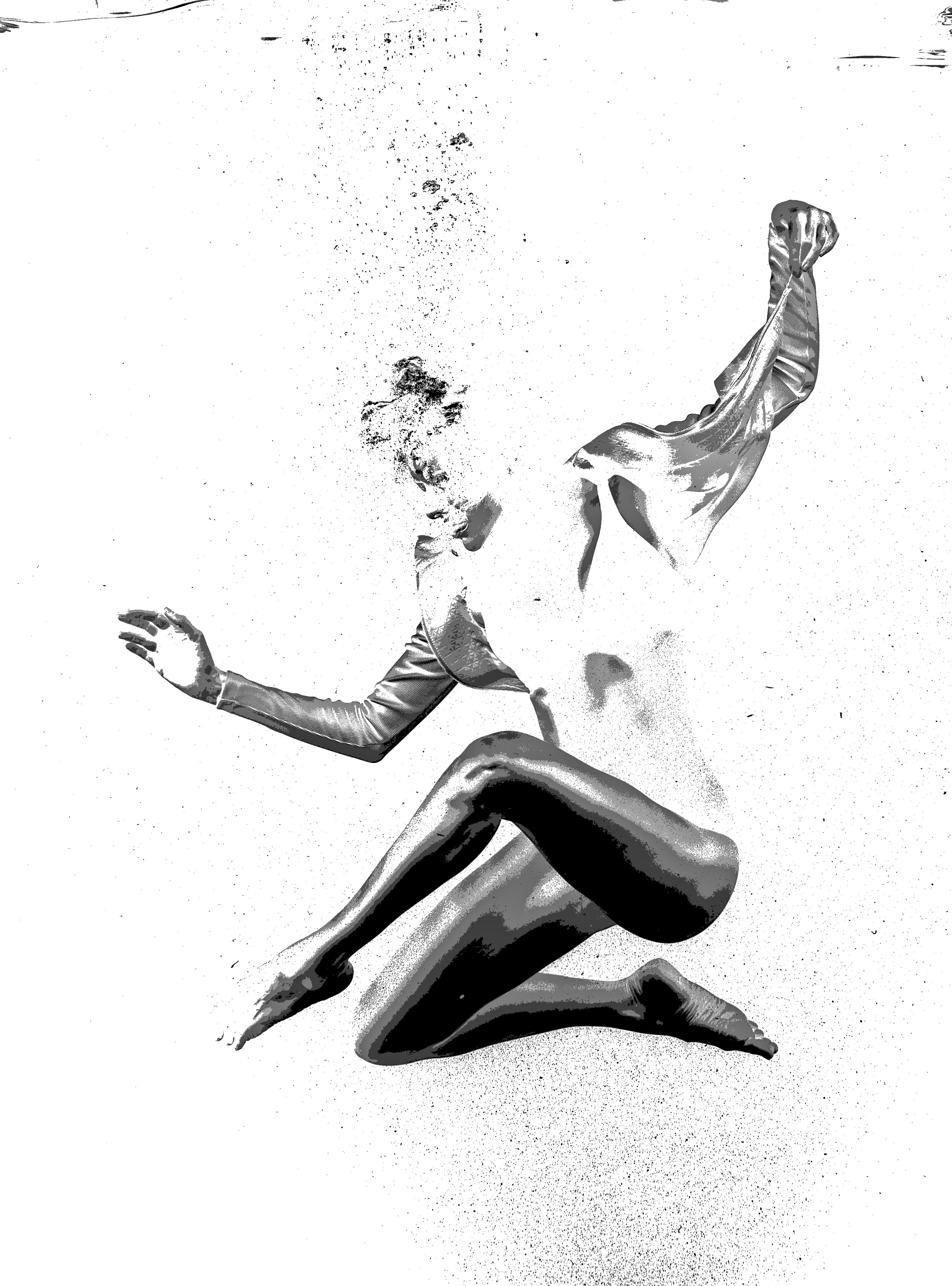
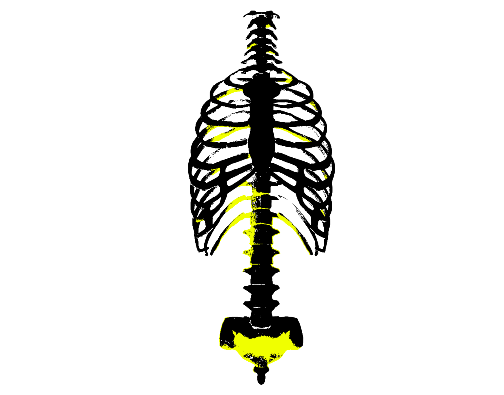
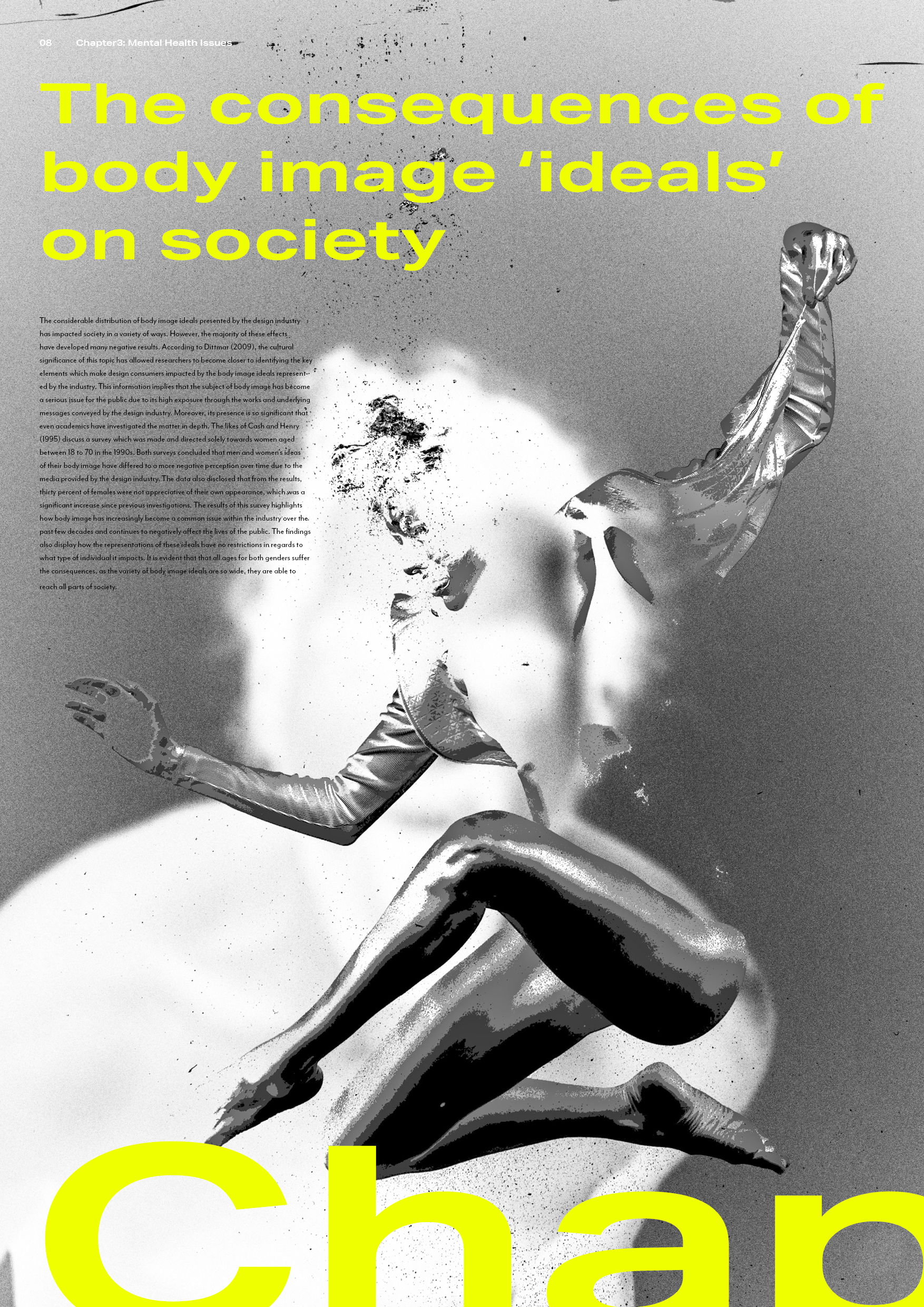
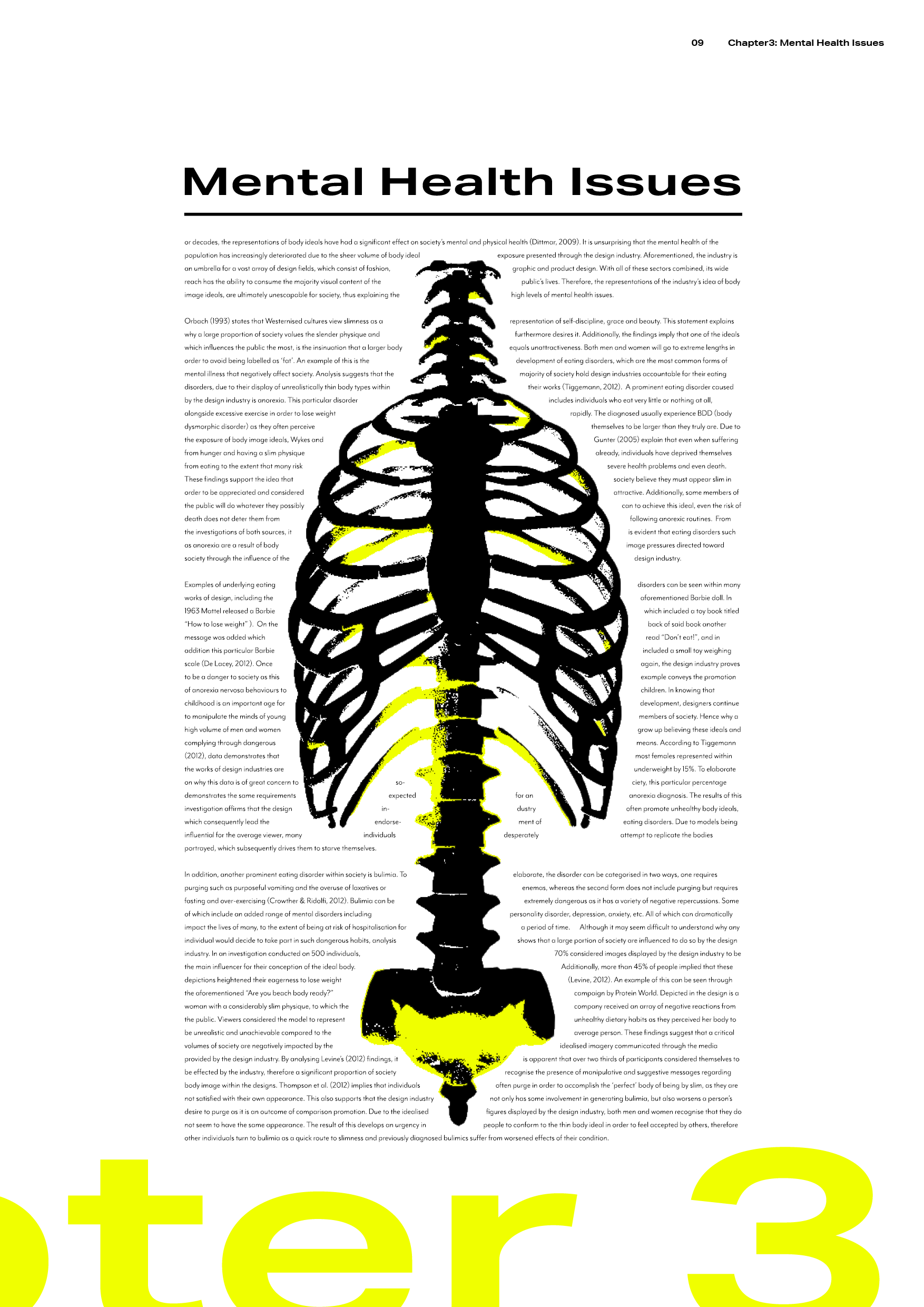
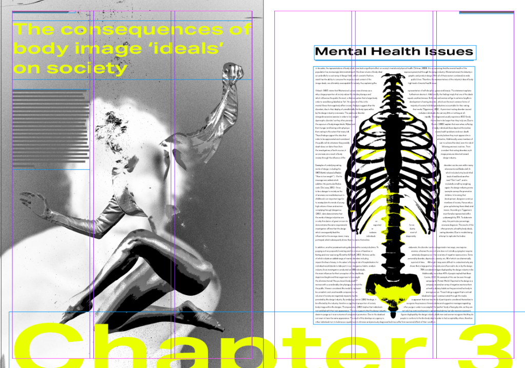
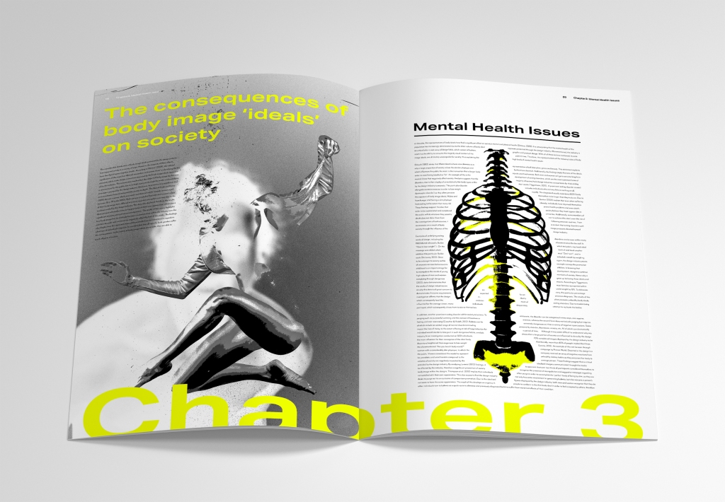
As previously mentioned within my blog, this spread was designed to demonstrate the subject of mental health. Sometimes a person’s thoughts about their body can consume them (just like drowning) – which is conveyed within this spread in an avant-garde way. In addition, I have included a skeletal visual as I wanted to represent the subject of anorexia within this piece. The text forms around this visual as I wanted to communicate how society often feel that they must conform to drastic/unrealistic body standards.
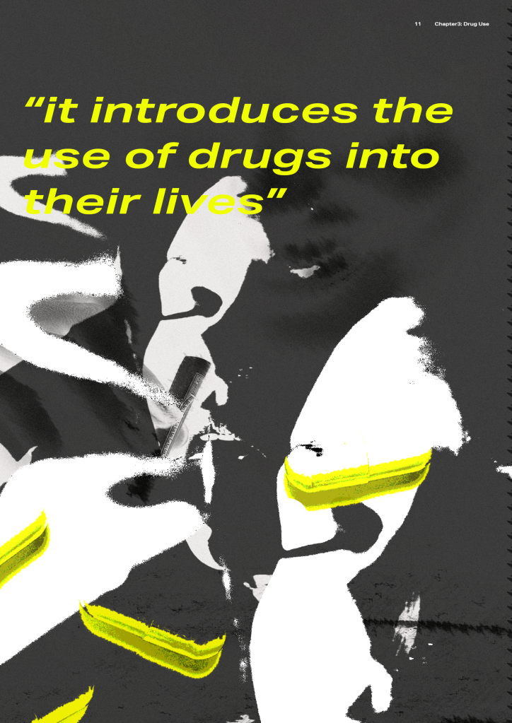
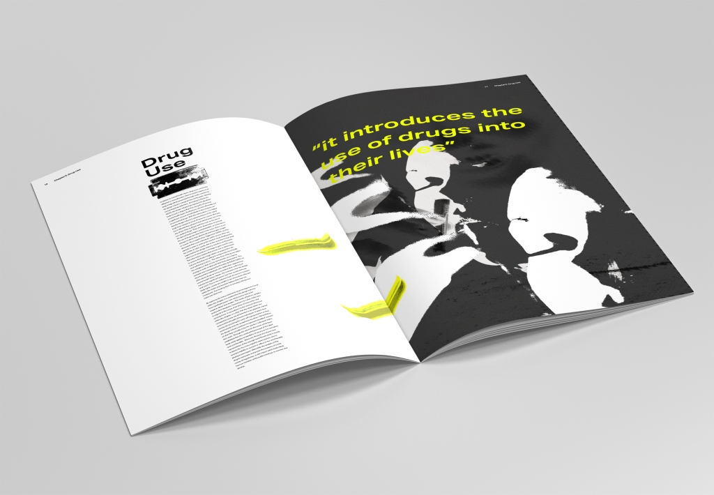
Spread 5:

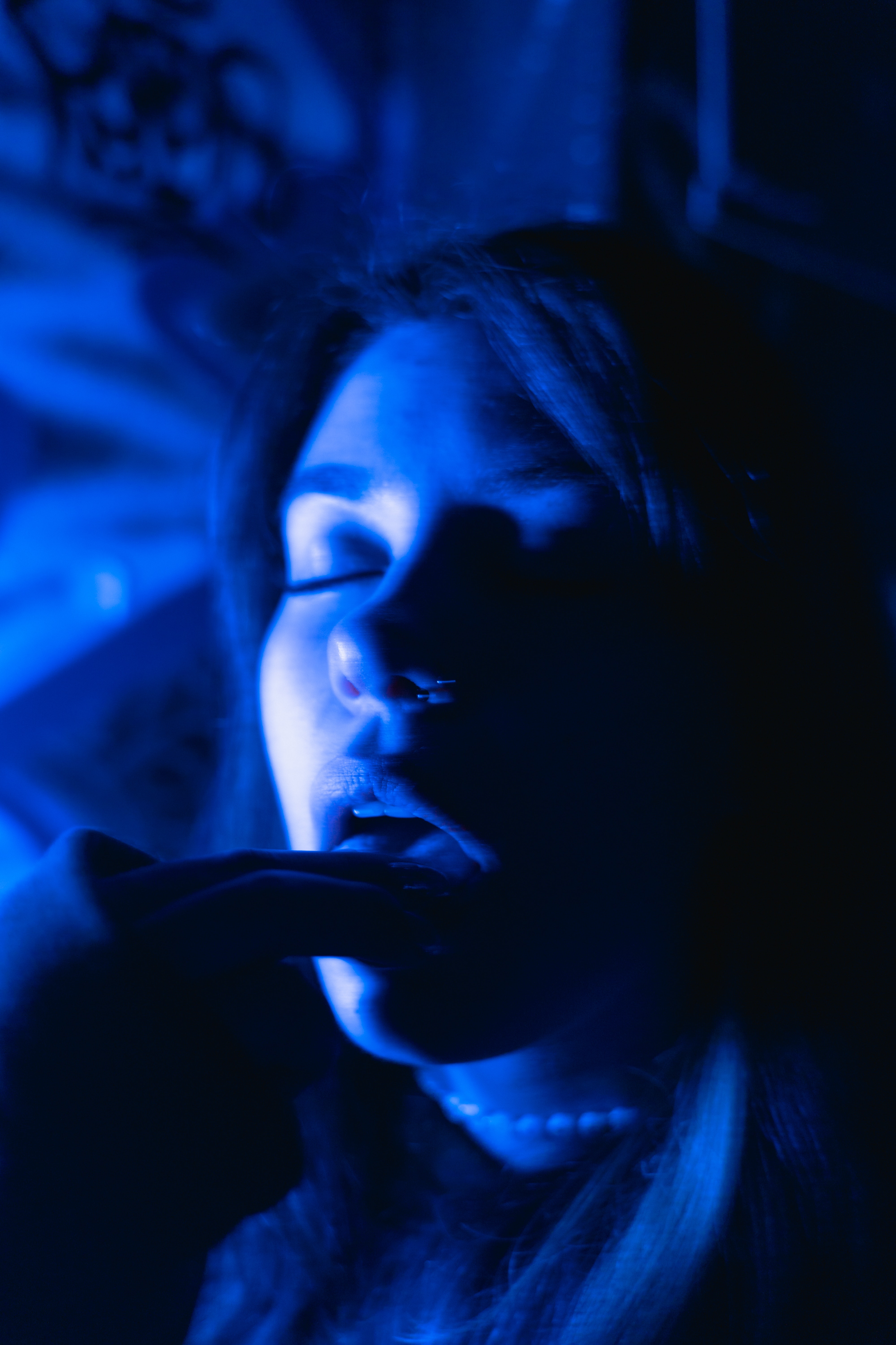
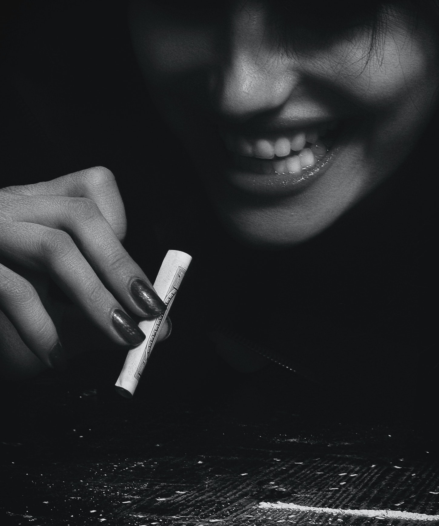
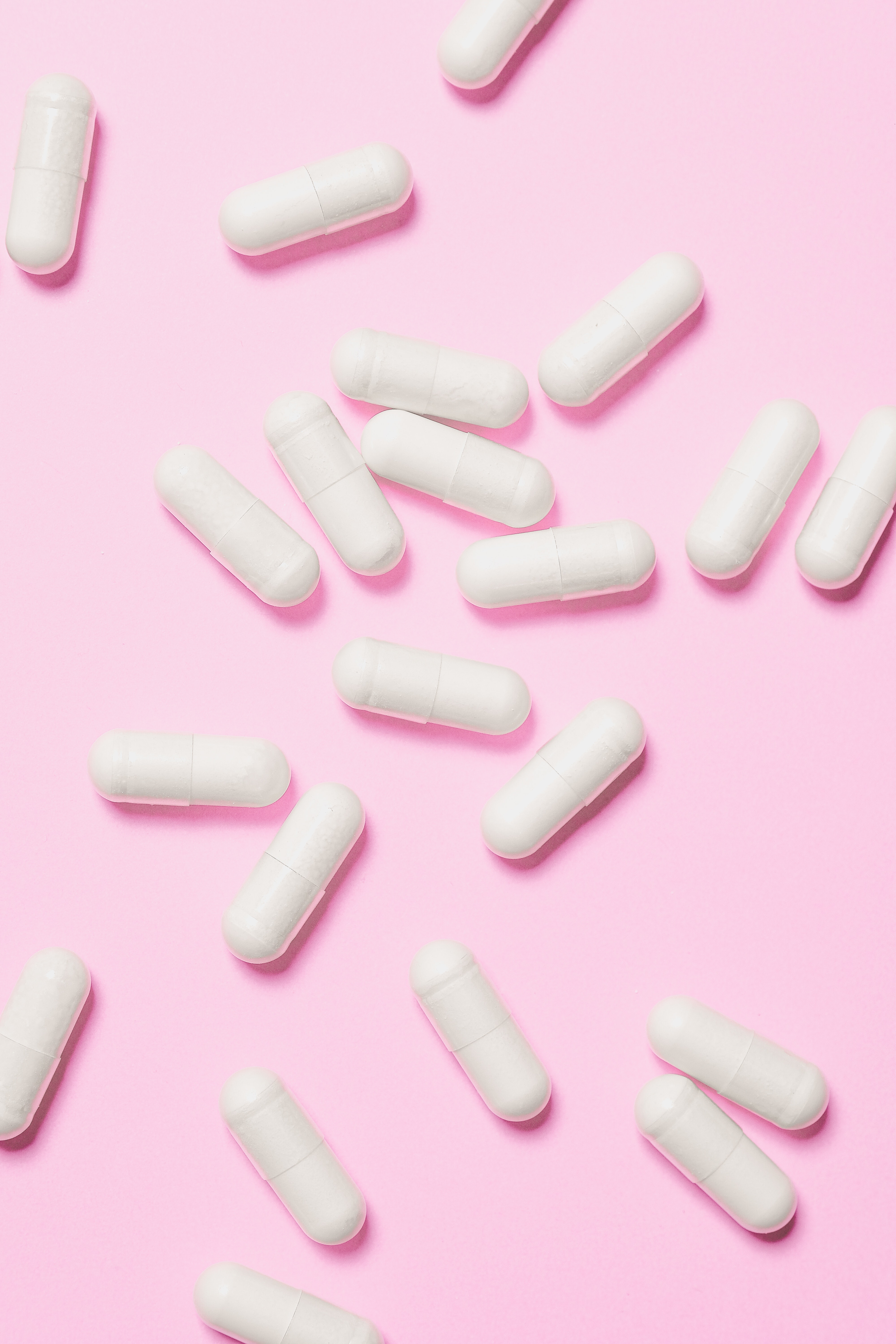
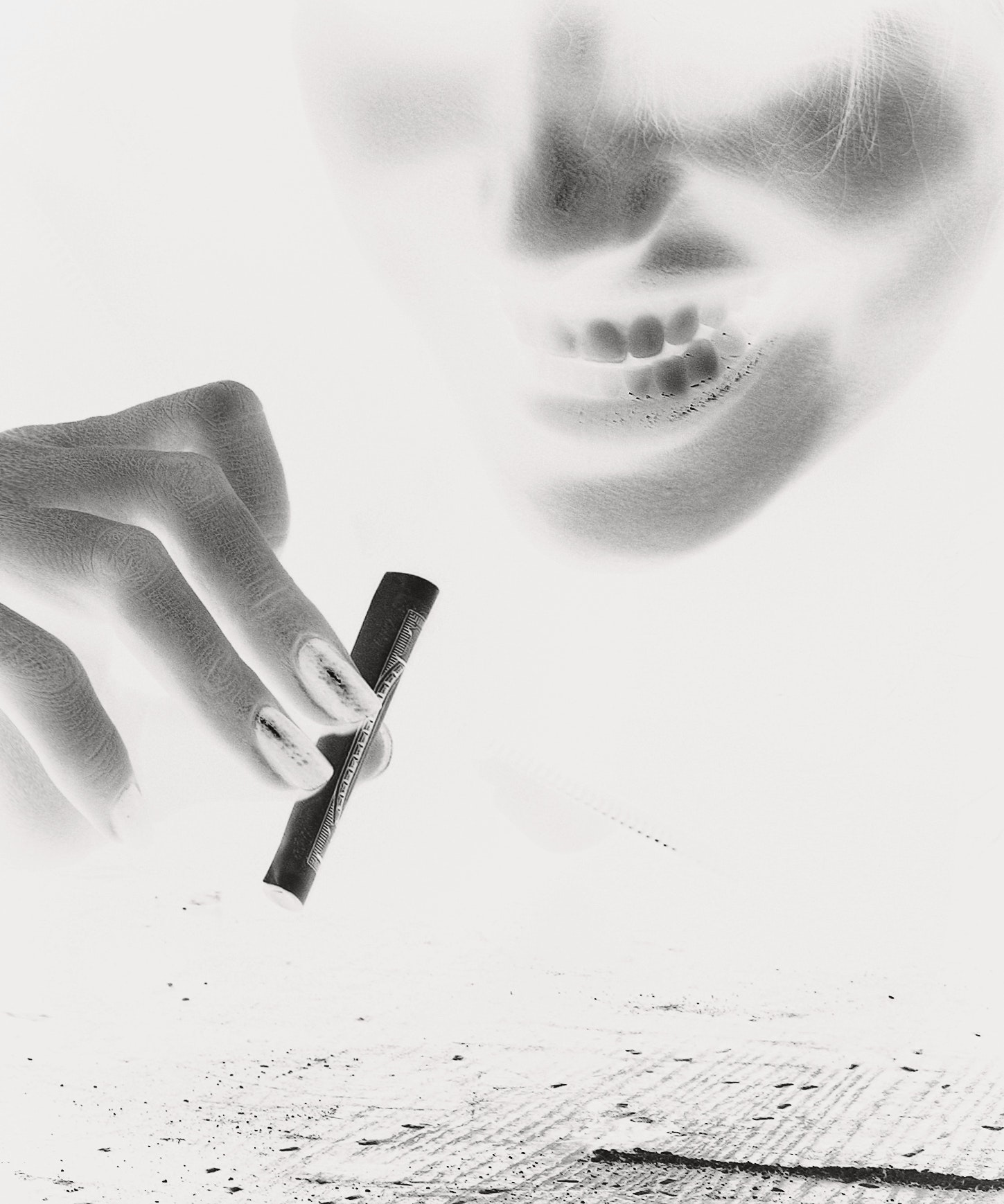
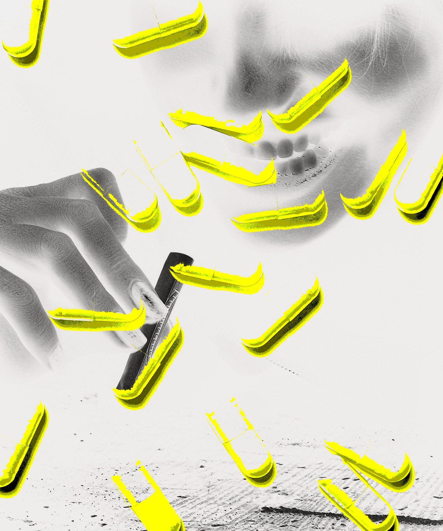
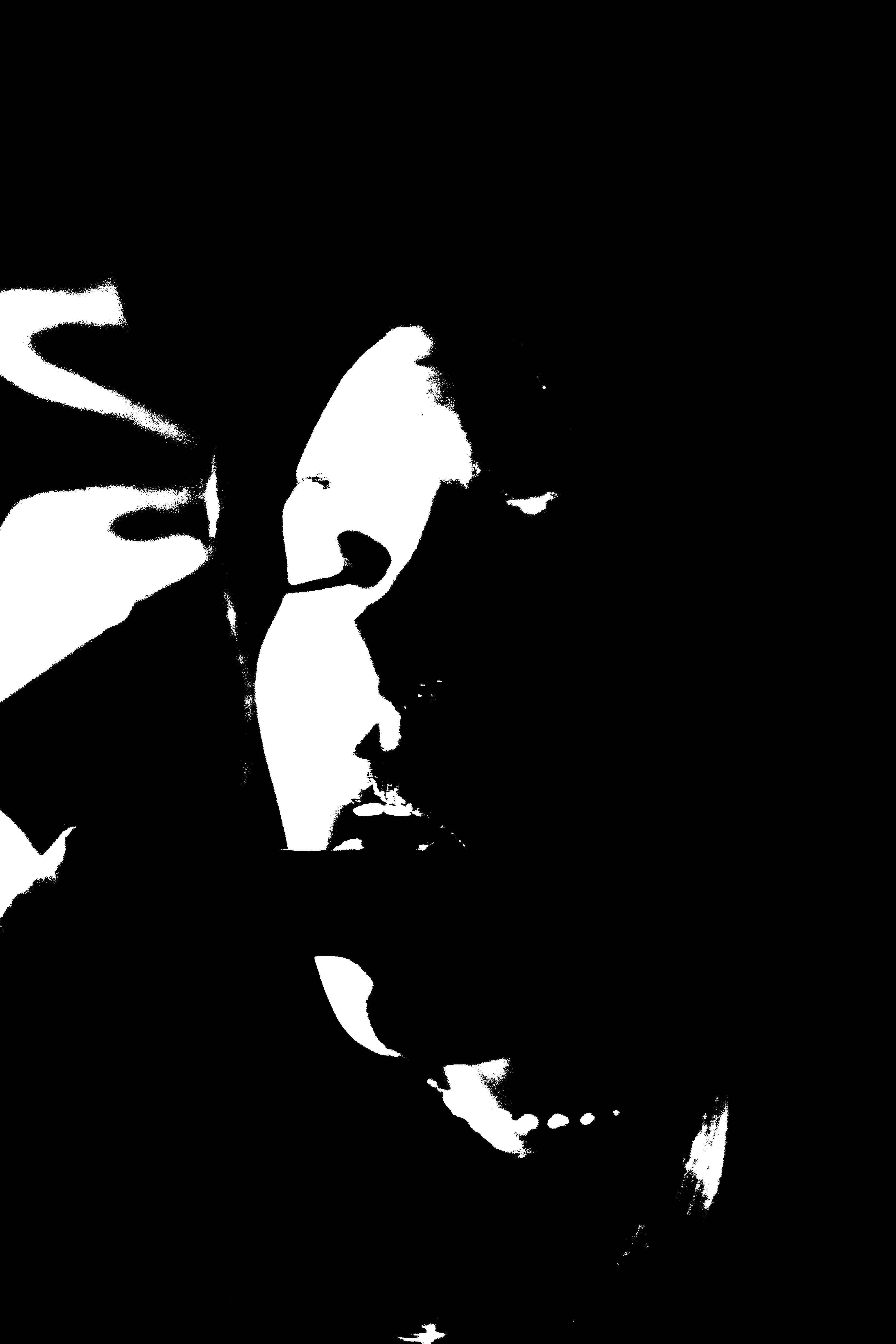
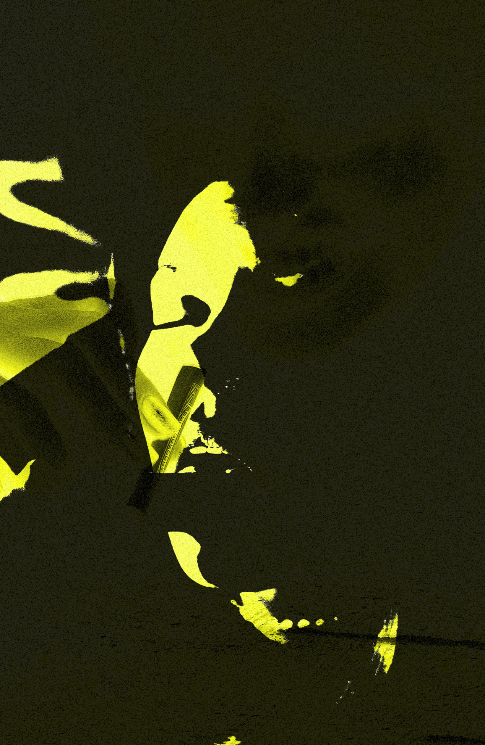
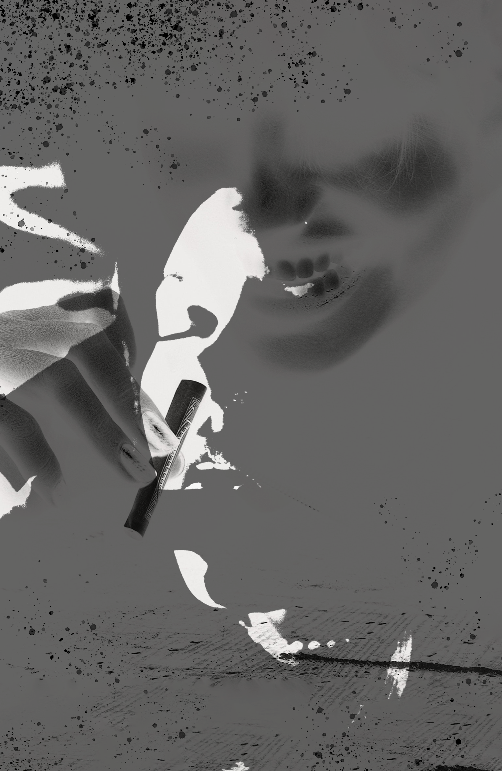
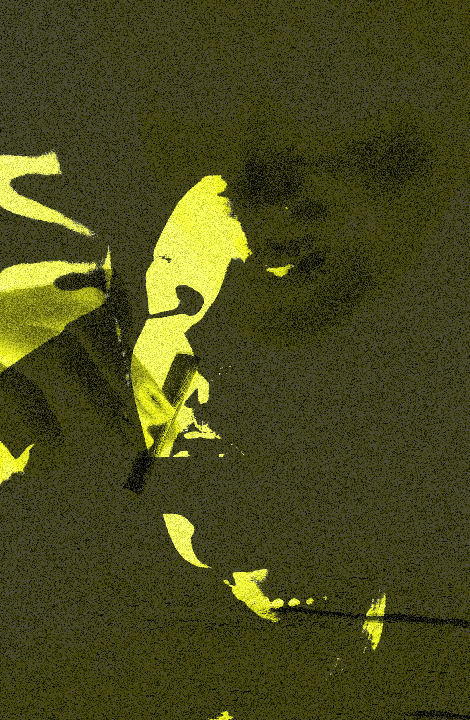
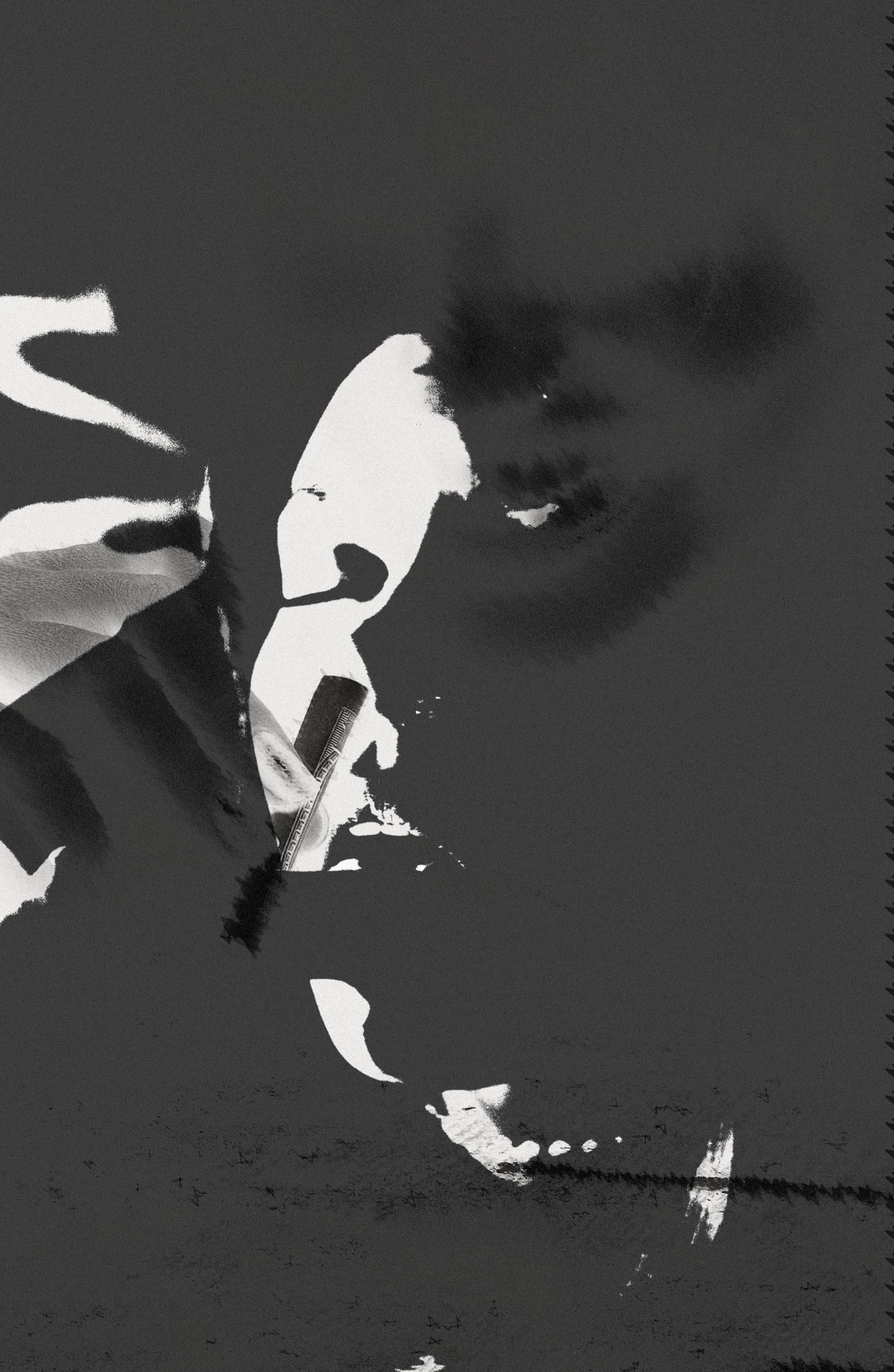
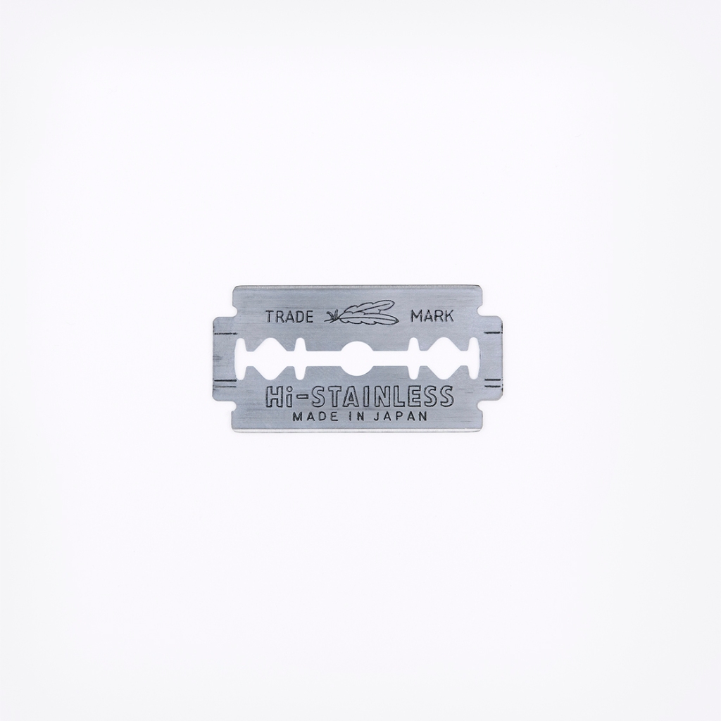
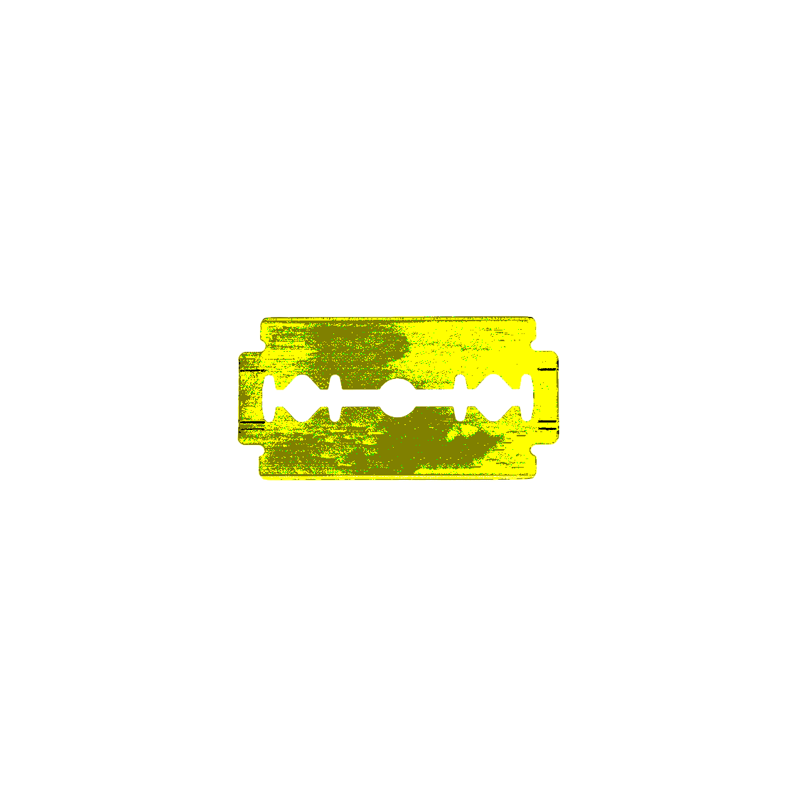
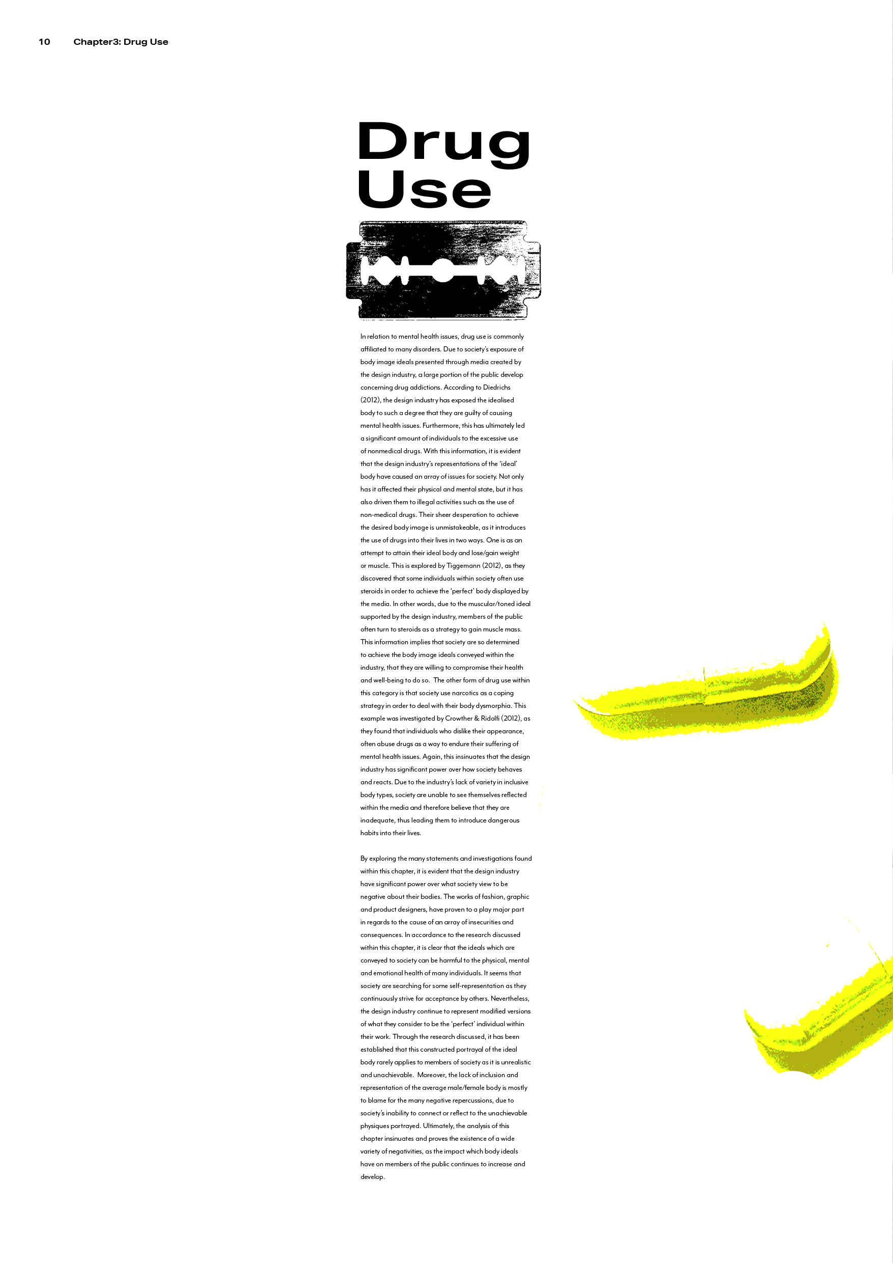
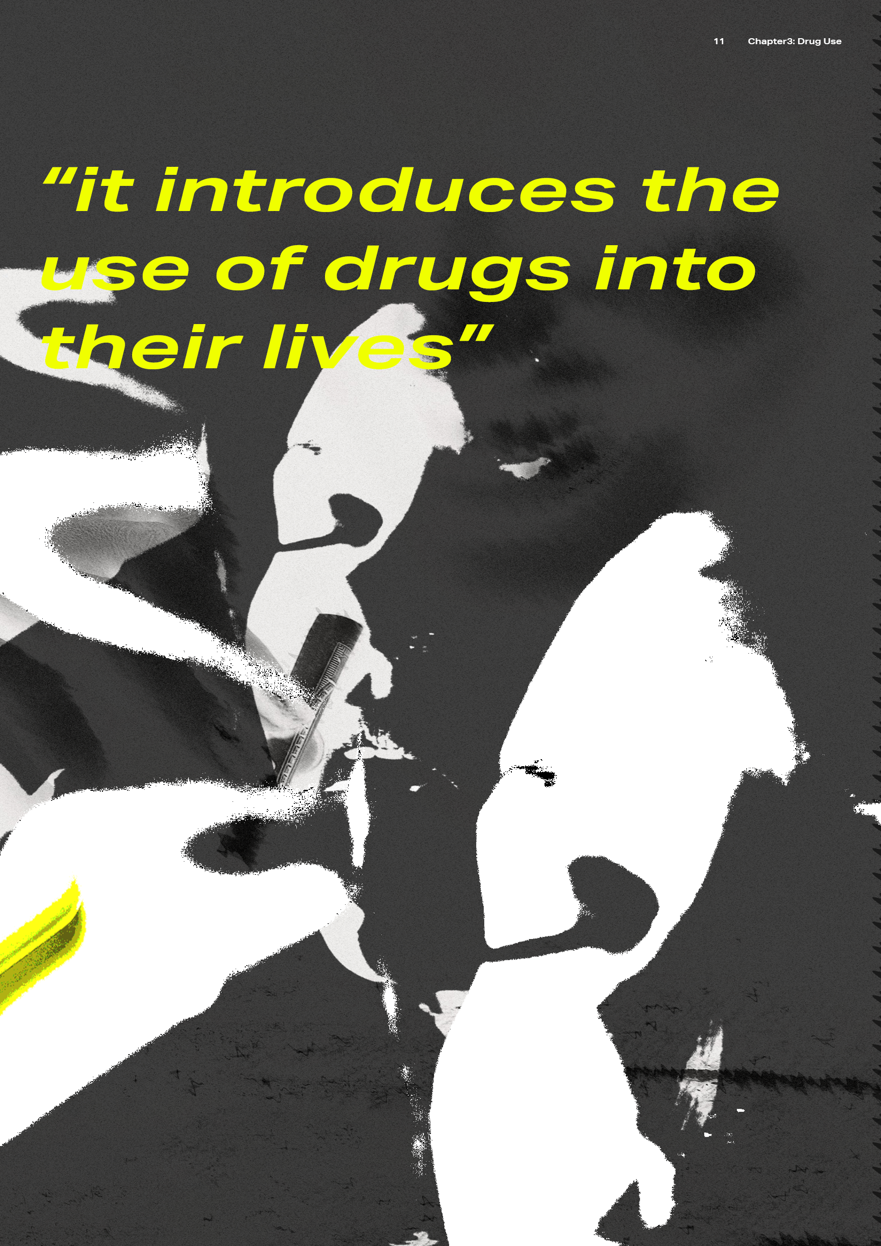
This spread discusses the topic of drug use, which meant that this subject became the inspiration for the visuals. Within this spread, you’ll notice that the text has been placed in a thin/long form followed by an image of a razor blaze. I did this in order to replicate a line of cocaine as I wanted to incorporate visual metaphor through the structure of the text.

Final thoughts

I have always been passionate about editorial design as I have felt more comfortable with the creative freedom – which in turn has allowed me to be more experimental during this project. I really enjoyed creating the imagery as I was able to test my design abilities in photo editing. Although I was excited for this project, I also found it quite daunting. I have always struggled with typography, so I found this brief quite intimidating. However, I was able to overcome this with my open-mindedness to experimenting with layout and form. Throughout the process, I ensured that I apply the feedback given by my peers/lecturers, along with the inspiration I had found within my research.

Since designing an editorial during first year, I believe I have come a long way in my design abilities. My personal style has been able to shine through in this project and it is one of my favourite outcomes of the year. In future I hope to continue to work on my typography for editorial designs and achieve an even better understanding of new and unique editorial styles.

Editorial – Imagery Developments

Subject - Year 3, Uncategorised

Spread 1

Although David was happy with my first spread’s imagery (which I had presented to him in a tutorial), I didn’t feel like it quite matched the distorted appearance I was looking for. It was important that I achieve this effect within all of my imagery in order to achieve a cohesive result within the entire editorial. Using similar techniques and effects I had applied within the design of my front cover, I experimented with how I could manipulate the original image to match. I did however keep some visual elements within this image, such as the hand drawn words/lines scrawled on top. Overall, I believe I was able to achieve an array of effective visuals which connected well with each other and the spread’s textual content. The spread’s heading was ‘graphic design’, therefore I wanted to use an image which best represented what type of visual would be used in a magazine i.e. Vouge, Cover, etc.

Original image

Spread 2:

The heading of my second spread was ‘Fashion design’, therefore I wanted to include an image which best represented that category. I ended up selecting an image of a woman barely clothed and posing as if she was in a fashion shoot. I felt that this image really demonstrated how the fashion design industry often exploit body image ideals within their models – which connected well with the spread’s textual content. Once again, I used Photoshop to heavily edit the image to create a distorted appearance. By looking at the image, I noticed how the model was posing to show off her body’s curves. I wanted this to be a highlighted feature within this spread, therefore I used her body’s form to wrap around the starting letter of the spread’s text. The outcome was extremely effective and demonstrates how people’s bodies are often manipulated to follow certain standards of ‘attractive’ shapes.

Original Image

Extra Images used:

Additionally, I wanted to push the issue of body weight within the fashion industry. So I used a measuring tape, which is often used as a tool within fashion for measuring garments but on the other hand, it can also be used to measure the body – thus giving it a double meaning. I then edited its appearance within Photoshop by using the same editing tools and achieved a matching appearance.

Spread 3:

This spread’s heading was ‘product design’ and within the text’s contents, I discuss how Barbie dolls play a part in creating body image ideals for women and children. With this in mind, I wanted the main focus of this spreads to be Barbie, I thought about how girls are brought up comparing themselves to Barbie and tried to represent this within the imagery. By taking a seemingly normal image of a woman, I attempted to combine her physique with Barbie’s face. I made sure to edit both images differently in order to create a stark difference between the two and convey how Barbie is an unrealistic standard of beauty within women. I felt that this image’s outcome was very successful as it allows viewers to understand the spread’s context before reading this section of the editorial.

Original Image

Extra Imagery used:

In order to add a personal element into the design, I created some hand drawn visuals of the lyrics from the ‘Barbie song’ and of a pull out quote I had selected from the page’s text. I felt that these images would add a sense of chaos into the design – which represents society’s decreasing mental state and panic over their bodies. In addition, I used my own ‘kiss marks’ by kissing a piece of paper and scanning the results into my computer. I was then able to edit these on Photoshop to adjust the to the design’s colour palette/theme. Doing this was very spontaneous (which I really enjoyed), and added another personal element into the spread – allowing it to appear handmade and helped emphasising the subject of cosmetics and physical appearance.

Spread 4

As this spread discusses and focusses on mental health, I knew that these were themes I needed to represent within my imagery. I personally struggle with mental health, so I took a moment to think about how it feels and how I may visualise it within my work. I come to the conclusion that sometimes, poor mental health can make you feel like your drowning in thoughts. I believed that this idea of drowning could be an interesting visual to convey this issue within the spread, therefore I retrieved an image of a woman underwater. I liked this image as the model didn’t appear to be struggling, she was actually posing in the water. This again relates to the idea that society will often do anything to conform to body image ideals, even if they may be dangerous. In addition to this image, I found a picture of a man screaming. I wanted to use this image as the background as it will help convey the stress this issue may cause to society.

Again, for both images I used the same methods of editing to achieve a matching appearance to the other visuals within the editorial. I experimented a lot with these images as I wanted it to appear more avant-garde. I did this in order create a more interesting visual which readers can interoperate its meaning for themselves.

Extra imagery used:

This spread also discusses issues such as eating disorders, therefore I believed it was important that I include a representation of that within the spread’s design. To do so, I took an image of human ribs/spine to convey the subject of anorexia. Anorexic people are often seen to be ‘boney’ and the result of this condition can often lead to death. With this in mind I felt that the inclusion of this visual was extremely relevant. Again, the original image was then edited to achieve the harshly edited visual you see below.

Spread 5

The heading of this final spread was ‘Drug use’ – with this in mind I was aware that it was important to demonstrate the theme of drugs within the visuals. Similarly to spread 4, I was very experimental with this imagery. I took an array of photography based images (which displayed drug use) and combined them to achieve another avant-garde design. I wanted this visual to appear as though it had layers as I wanted to convey the addiction that drugs can cause. Additionally, layering the images with each other created a more chaotic design – which allows the reader to recognise the distressing effects of drug use. Similarly to the other visuals within the editorial, I used the exact same editing methods to achieve a cohesive style.

Extra imagery used:

Razor blades are a symbol of both mental health issues and drug use – as the blades are often used to separate cocaine. I decided to use this imagery as a nod to cocaine use and felt that it could be a stand alone image within the spread due to its serious connotations.

Editorial – Development (Front cover)

Subject - Year 3, Uncategorised

Taking into consideration the research I had done and the feedback I had received, I began applying these ideas into my design. I began with the front cover as I felt that it would be a good way to establish my editorial’s aesthetic. As I have previously mentioned, I wanted to focus my attention on creating interesting visuals for my design, therefore I spent a significant amount of time ensuring that I experimented with all the imagery possibilities.

From the start, I had decided that I wanted my visuals to consist of photography style images. I felt that using pictures of real people would connect better with my dissertation topic as I would be able to add a more personal feel to the editorial – which will allow readers to relate easier. I selected the image below from a website called ‘Pexels’. It displays a woman with a very thin physique grasping at her body. I believed that the use of this image on the front cover would be very effective as it subtly demonstrates the subject of eating disorders. This is very relevant within my dissertation, therefore this image would instantly convey this to readers.

The original image

I then took the original image and experimented with its appearance on Photoshop. I was eager to use effects such as the inverted and posterise filters. In my opinion, these filters add a harsh effect to the image and conveys the seriousness of the editorial’s topic. With my imagery, I ultimately aimed to achieve a distorted look. I did this to try and replicate how the public’s perception of their bodies have been distorted by the design industry.

Further experiments:

In the two images below, you can see that this is where I began to experiment by incorporating the text. I found this part of the process the most difficult as I wanted to keep the front cover minimalistic but still interesting. Due to the main image being so large, I found it tricky to add the text in an effective way. I noticed that using a small point size for the cover would be difficult as it did not stand out enough against the imagery. To combat this, I would need to enlarge the text, however I wasn’t happy with using bigger text as I find that it can make a design appear childish and often unprofessional. I knew moving forward that I would have to edit the main image further if I wanted to help the title appear more visible.

Editorial – Idea generation and Design tutorial

Subject - Year 3, Uncategorised

Moodboard

As I usually do at the start of a project, I created a moodboard in order to bring my themes, design styles, colours and content exploration together. I also used these images to help familiarise myself with variations of formats and layouts – this would later benefit me when searching for inspiration. I collected these particular images as I found that they could all connect to my dissertation topic in some ways. I liked that each of them illustrated form and shapes through the use of text and imagery. Within the images used, it is clear to see that there is a heavy communication of visual metaphors. This is something I knew that I wanted to incorporate within my editorial as I believed it would really help connect all elements together in a professional and effective way. Visual metaphors can add narrative to seemingly straight-forward content, and that’s exactly what I wanted to achieve.

As you can see within the moodboard, I was particularly fond of ‘highlighted’ effects. I thought that this idea of ‘highlighting’ was extremely interesting visually and contextually. By using this effect, I could use visual metaphor to demonstrate how the design industry often draws attention to body features and what are considered to be attractive/unattractive. I felt that this would be interesting and was would be worth exploring further within my design development.

Themes to consider:

  • Shapes – to represent the body
  • Body parts which are commonly associated with ideals
  • Dark undertones – to represent the seriousness of the topic
  • Manipulation – in imagery and text to represent the manipulation of the body
  • Highlighting – bringing attention something, similarly to the design industry does with the body
  • Mental health – focussing on eating disorders and use of drugs
  • Conformity – to represent how society follow the ideas conveyed by the design industry
  • Exploitation – individuals in minimal clothing = being exposed

Selected colour palette:

Selected Typefaces:

I chose to use the sans-serif Aktiv Grotesk Ex as it’s straight blocky lines and pointed edges appear harsh and exudes an aggressive visual. I felt that this was perfect for conveying an issue as forceful as this. This effect also juxtaposes the imagery of the soft looking feminine models.

For the body text I chose a more classic typeface as it’s appearance is less aggressive and more neutral. This allows for an easier read for the viewer but still matches the tone of the editorial’s content and other visuals/text.

Design tutorial (first attempt at first spread)

For my second tutorial with my lecturer, we were asked to prepare and present the first draft of our first spread. We did this relatively early within the creative process, therefore I had to create this design rather quickly. As you can see, I closely followed the design styles I found through my research and moodboard design. I selected the black, white and neon yellow colour palette in order to keep its design modern yet bold. The neon yellow plays a significant part within this design as I wanted to convey a ‘highlighted’ effect throughout. Additionally, this effect can be seen within the main body of text. Here, I used it to draw attention to the most relevant words (mainly the ones associated with negativity). For the form of the text, I once again used my research as inspiration as I wanted to manipulate its shape. Creating a curve with the text was done to represent how women’s bodies are often manipulated to conform to body image ideals. I really liked this effect and wanted to continue to use it throughout.

As for my main visual, I used a picture of a minimally dressed woman. I did this as I wanted to convey the theme of exploitation. I had found when writing my dissertation that design industries are guilty of exploiting societies insecurities, therefore I felt it was necessary to represent within this design.

Feedback: Within my tutorial with David, I was extremely pleased to hear how happy he was with my outcome. He really admired the use of visual metaphor, especially through my use of form and shapes. He also commented on the main visual (seen on the left page) and stated that he really liked how the repetition of the image brings focus to the the visual. David also approved of my typeface selection – which was ‘Aktiv grotesk’ for the titles and ‘Mr Eaves OT’ for the body text. Furthermore, he approved of the type’s setting as he felt that the sizing would be accurate for printing. The only things he mentioned that I include next time were pull out quotations, page numbers and running heads.

Editorial – Analysing the work of previous students

Subject - Year 3, Uncategorised

In order to spark some inspiration, I decided it would be a good idea to take a look at the editorials which were created by previous students.

Karlis Kah

By looking at Karlis’s work, it is clear to see that they like to be very experimental with their imagery and allow them to become the main visual element of the editorial. I admire this because they weren’t afraid to demonstrate their creativity within such a serious piece of work. Using such large images is also great for breaking up a design and for giving the text some room to breathe. All of their images also relate to the subject matter. For example, their editorial discusses manipulation, therefore Karlis demonstrates this through distorted imagery. I like this attention to detail as it gives the visuals some context. It also allows the editorial’s content to reflect through the work in a more creative way. Furthermore, I admire how Karlis was not afraid of stepping outside of design limitations – this is demonstrated through the overlapping of text. I hope to apply similar design methods within my own work as I believe I too would like to create an outcome close to this.

Carys Matthews

Carys’ work, is minimalistic by her use of colour palette and little imagery – this style is one of my personal favourites and I often gravitate towards it within my own designs. Using a more minimalistic style allows her editorial to appear clean and very sophisticated. It is clear to see that she isn’t afraid to use smaller amounts of text with large spacing. I admire this a lot as it helps to keep the editorials content legible. I too hope to achieve a similar effect with my own design, as I do not wish to overwhelm the reader with information. Similarly, Carys uses imagery which closely relates to her textual content. She also uses visual metaphor to convey the editorial’s overall message – which I intend on using within my own work as I believe it would create better flow from text to imagery. In her colouring, Carys uses a very minimal palette of black, white and green. The use of this type of colour palette is extremely effective as the bright pop of green allows certain elements of the design to stand out. This is something else I would like to demonstrate within my own editorial.

Bibliography of images

https://www.behance.net/gallery/97620899/THE-MULTI-SENSORY-BRAND-EXPERIENCE-dissertation

https://www.carysmatthews.co.uk/dissertation

Editorial – Research

Subject - Year 3, Uncategorised

What is body image and how does it affect society?

Body image is a person’s thoughts, feelings and perception of the aesthetics or sexual attractiveness of their own body. The concept of body image is used in a number of disciplines, including psychology, medicine, psychiatry, psychoanalysis, philosophy, cultural and feminist studies; the media also often uses the term. Across these disciplines, there is no single consensus definition, but broadly speaking, body image consists of the ways people view themselves; their memories, experiences, assumptions, and comparisons about their own appearances; and their overall attitudes towards their own heights, shapes, and weights – all of which are shaped by prevalent social and cultural ideals.

Body image can be negative (“body negativity”) or positive (“body positivity”). A person with a negative body image may feel self-conscious or ashamed, and may feel that others are more attractive. In a time where social media holds a very important place and is used frequently in our daily lives. People of different ages and genders are affected emotionally and mentally by the appearance and body size/shape ideals set by the society they live in. These standards created and changed by society created a world filled with body shaming; the act of humiliating an individual by mocking or making critical comments about their body shape and/or size. There are different of body shaming someone and yourself, according to anad.org “We are our own worst critic” which means that we judge and see our own flaws more than anyone else. We body shame ourselves by judging or comparing ourselves to someone else.

Aside from having low self-esteem, sufferers typically fixate on altering their physical appearances. In the long term such behaviour creates higher risks of eating disorders, isolation, and mental illnesses. A negative body image may also lead to body dysmorphic disorder, a mental disorder characterized by the obsessive idea that some aspect of one’s own body or appearance is severely flawed and warrants exceptional measures to hide or fix. Often, people who have a low body image will try to alter their bodies in some way, such as dieting or by undergoing cosmetic surgery. Positive body image, on the other hand, consists of perceiving one’s figure clearly and correctly, celebrating and appreciating one’s body, and understanding that one’s appearance does not reflect one’s character or worth.

Many factors contribute to a person’s body image, including family dynamics, mental illness, biological predispositions and environmental causes for obesity or malnutrition, and cultural expectations (e.g., media and politics). People who are either underweight or overweight can have poor body image. However, when people are constantly told and shown the cosmetic appeal of weight loss and are warned about the risks of obesity, those who are normal or overweight on the BMI scale have higher risks of poor body image. “We expected women would feel worse about their bodies after seeing ultra-thin models, compared to no models if they have internalized the thin ideal, thus replicating previous findings.”

A 2007 report by the American Psychological Association found that a culture-wide sexualization of girls and women was contributing to increased female anxiety associated with body image. An Australian government Senate Standing Committee report on the sexualization of children in the media reported similar findings associated with body image. 

How I intend on applying this information into my designs:

Although the information above only displays a small portion of my research on this topic, I felt that it was necessary to summarise the information I had done in order to give myself a clearer idea of the context behind my editorial. After looking over my research, it is clear that I must encapsulate the issue as a whole within my designs – this would allow the reader to understand the editorial’s content without having to actually read it. Furthermore, I must convey the seriousness of the issue by translating this into the designs overall appearance, as I want the viewer to recognise the dark undertones within the editorial’s contents. This would relate to the negative impacts on society such as mental health issues, physical health issues and drugs use.

Bibliography

Grogan, S (2016). Body image: Understanding body dissatisfaction in men, women and children. Taylor & Francis.

 “What is Body Image?”. National Eating Disorders Association. Retrieved October 31, 2017.

“Body Shaming. What It Is & How To Overcome It | ANAD”National Association of Anorexia Nervosa and Associated Disorders. Retrieved December 2, 2020.

 Derenne, J. L.; Beresin, E. V. (June 1, 2006). “Body Image, Media, and Eating Disorders”. Academic Psychiatry30 (3): 257–261. doi:10.1176/appi.ap.30.3.257

Dittmar, Helga; Howard, Sarah (December 2004). “Thin-Ideal Internalization and Social Comparison Tendency as Moderators of Media Models’ Impact on Women’s Body-Focused Anxiety”. Journal of Social and Clinical Psychology23 (6): 768–791. doi:10.1521/jscp.23.6.768.54799.

https://en.wikipedia.org/wiki/Body_image

 “Report of the APA Task Force on the Sexualization of Girls”(PDF). American Psychological Association. 2007.

“Sexualisation of children in the contemporary media”. Parliament of Australia. June 26, 2008. Retrieved May 3, 2016. 

Editorial – Introduction Tutorial

Subject - Year 3

Introduction to the brief

Using our writings and musings from our dissertation, for this brief we were asked to create a design which takes the dissertation’s content and uses it to showcase our editorial design skillset. We are able to do so in whatever format size and scale that we see fit. Overall, we were asked to submit our digital dissertation designed PDF consisting of a single page cover and at least 5 double page spreads.

My dissertation title was “An investigation into the representations of body image ideals; To what extent does the design industry have a negative impact on society?”. Within my thesis I wanted to explore the subject of body image as I have always been passionate about representing body positivity and acceptance. During my time as a junior graphic designer, I have come to recognise the issues within the design industry regarding the many unrealistic body image ideals they portray to society. This concerns me greatly, as I have discovered through research how the public can form an array of negative responses to the display of these ideals. As a result, I felt that it was necessary that I discuss this subject matter within my dissertation.

First Tutorial (group work)

To introduce us to the project, our lecturer David ran a type and layout workshop where we worked in small groups via Teams. The challenge was to design an A3 double page spread using a body copy which was provided. This tutorial was put in place in order to helps us explore setting text and expressing different hierarchies.

Constraints:
1 – One typeface, one weight, one size, one size leading, multiple colours (11:15am) D&U
2 – One typeface, multiple weights, one size, one size leading, multiple colours (12pm) D&U
3 – One typeface, multiple weights, multiple sizes, multiple sized leading, multiple colours (1pm) D&U

This was my group’s first outcome:

He also liked how the subtle hints of pink (mainly used for the statistics) made the information easier to break down and that this made the path for the eye really clear. Additionally, he noted that the rag was a rather untidy and that it would need a little more work if there was more time to do so. But overall he was really pleased with this the outcome considering we were under a time constraint.

Our second outcome:

The feedback for our second outcome was that David (our lecturer) thought that this development was actually a step back from the first outcome. In his opinion, there were too many colours involved, and that the use of yellow and pink for the statistics didn’t really work on the teal background. However, he did like the blocks of yellow for the headings of each paragraph as he stated that this helped them stand out more. In addition, he liked the use of colours to separate the table – as it broke up the information and made the table easier to follow.

Our third outcome:

By looking at this final outcome, David really liked it and said that the titles worked really well as they demonstrated hierarchy and allowed the design to appear more visually interesting. Something he noted was that the table didn’t need the black lines separating the figures because the colours did this adequately enough on their own. At this point we had incorporated all of the admired elements from our previous designs which led us to achieve a more successful outcome (which our lecturer approved of).

Final thoughts

Overall, I really enjoyed this workshop as it allowed us to work together as a team (which we haven’t had the opportunity to do much this year). As a group we were able to learn how to apply our designs quickly – to produce some really interesting pieces of type. Doing this tutorial also really helped to refresh my memory of editorial design, as I hadn’t created any of these since our first year on the course. It was really important that we develop this skillset again in preparation for the upcoming dissertation design brief. By completing this tutorial, I was able to refresh my memory of important factors of typesetting, such as a clean rag, no rivers in justified text, no orphans, correct point size, and ensuring a legible design. I will keep what I have learned within this tutorial in mind and I plan to apply this knowledge throughout this project.

FMP – Creating the Instagram Posts/GIF

Subject - Year 3, Uncategorised

Due to the fact that Modifyx is a gaming software, I felt that it was necessary to create social media posts (specifically instagram). Social media plays a large part within the gaming community as almost of their entire existence is based online. I knew that with a brand as visually interesting as Modifyx, it would be beneficial to focus on creating designs for Instagram. To achieve the final designs, I heavily relied on my billboard designs for inspiration. Simply put, I used the same imagery and information, except I altered the layout to suit the 1080 x1080px instagram format. I decided to do this as a way to keep the branding accurate throughout my outcomes. Doing so allows viewers to easily connect all of the outcomes together. Similarly to the billboards, I ensured that each post was creative and displayed some sort of narrative – to attract the interest of viewers. Each post includes information which connects to its imagery. For example, the firth post states “Take back control of your gameplay” and displays an illustration of a ‘ctrl’ computer key. This gives the post a narrative aspect – which also helps with creating a more friendly brand.

The messages themselves are seen/used throughout the other outcomes I have made – which again helps with brand continuity. Doing this also helps remind viewers of the software’s message/purpose – as it is continuously repeated within the branding.

Social Media GIF

In addition to the instagram posts, I created a GIF which displays the Modifyx logo. I did this to add another medium to the instagram page. If Modifyx wanted to post to introduce their software, this GIF would be perfect to post. Adding movement to an intsagram profile creates a more dynamic variety of online content. This GIF also closely references the other videos designed for this software.

FMP – Creating the Billboards

Subject - Year 3, Uncategorised

To add another part to the promotional campaign, I decided to design some billboards. I felt that although the gaming community are usually based online, I should still include some external designs to reach a wider audience. If not gamers, then potentially friends and family members could see these billboards and recommend the software to their loved ones who game. Aside from reaching more users, I wanted to create billboards in order to demonstrate my capabilities in print design. As this project is mainly based online, I felt that it was necessary to include within the outcomes, in order to cover a variety of promotional locations.

Design inspiration:

Once again, I turned to Twitch for some inspiration as I had noticed within my research that they too use billboards to promote their site. (I would have looked to Steam/Battle.net too but they do not currently have any external promotional designs). By looking at these designs, I was instantly drawn in. They appear to section out their billboards like multiple posters – which is interesting and different. I liked this because it allows the viewer to focus on one thing at a time and doesn’t clutter the overall design. Its simplicity also ensures that passers by do not need to focus on the billboard much as they are able to read the message quicker. I admired these design choices as I wanted to communicate the information regarding my software in an easy yet effective way. In relation to hierarchy, it is clear to see that Twitch put heavy emphasis on their logo as it is the element they want viewers to remember the most. Again, this is another design feature I intended on achieving.

Twitch - Rapport US
Twitch Brand Campaign - Matt Gravish
Saw this billboard in Chicago tonight : offlineTV

Final Billboard Designs

My final designs achieved a sophisticated yet modern design, with its bold colours and sectioned information/visuals. In some ways, I designed multiple small posters within one billboard – which allows the design to appear more visually stimulating and appealing. Using this method also helps display a variety of different information and visuals as they don’t need to necessarily relate to each other much. To achieve an effective result, I made sure to consider hierarchy. This can be seen as the brand’s logo is the main visual feature, followed by the software’s description, then the brand message.

Within the design, I ensured that I carry the brand’s visual guidelines throughout in order to ensure that the designs connect well with other promotional outcomes. I relied on the bold colours and youthful aesthetic to attract a youthful audience. For visuals, I included the various illustrations I had previously designed. This would create a contrast to the text and convey a more interesting appearance for viewers. I ensured that these illustrations complimented the information conveyed as they somewhat relate to its context. For example, the second billboard says “The ultimate software to ensure a safer gamer experience for all” (which can also be seen on the software’s landing page), therefore I used a jolly looking monitor to match – thus creating a narrative within the design.

Overall, I am extremely happy with what I was able to achieve with these billboards. They demonstrate the software’s purpose/message accurately and easily in a modern way. I believe these outcomes are very effective and remain cohesive with the other designs within my FMP.

FMP – Creating the 20sec Youtube Advertisement

Subject - Year 3, Uncategorised

As a part of the promotional campaign, I wanted to ensure that all platforms would be covered. Instead of creating a TV advertisement, I decided to use Youtube as the platform. Youtube ads are usually around 20 seconds to a minute long and pop up at various times during a normal Youtube video. The shorter advertisements are usually unskipable, whereas longer ads are able to be prematurely ended. Youtube is extremely popular amongst the gaming community as there is a large amount of professional gamers which post videos there. With this in mind, I was believed that I would be able to reach the correct target audience if I were to create an ad for this platform.

For my advertisement, I decided to opt for a shorter video as it would be unskipable – which means the viewer would have to watch the entire thing. I felt that it was important for the viewer to see the whole video as it would provide better context about the software. Furthermore, a shorter video with snappy transitions ensures that the viewer is more likely to fully engage with the video.

Visual inspiration

During my research into gaming platforms, I noticed that Twitch often use this ‘repeating’ style – where they use the same text and display it over and over again. This style of design isn’t dedicated to Twitch as I have seen it in design many times before. However, I feel that it draws in the attension of the viewer as they are eager to read its contents. In addition, it applies emphasis to any message – which is something I wanted to do myself. Due to the fact that I do a very similar thing with ‘repeating’ Modifyx’s slogan on the software’s homepage, I wanted to try and implicate this style within my own design. My instant reaction to this style was that it had great potential within a moving context. I thought about how the text could easily be interchangeable and fun with how it could move on screen. By adding this style into my short video ad, I hoped I would be able to capture the audiences attention in a unique and interesting way.

The Final Video

Overall, I believe the final outcome is very effective. It catches your attention from the start due to the catchy music, bold colours and interesting visuals. These were my exact intentions throughout the process and I was happy that I was able to achieve them in the final result. Although, the video can be fast paced, its simplicity allows the viewers to be able to easily retrieve the exact information they need moving forward. The video also appears professional and its overall appearance is cohesive with the software’s current branding – thus ensuring continuity.

The message of the video is conveyed through the brand slogan “fyx the…”. These simple short sentences allow the viewer to read through them quicker and therefore allows them to easily understand the software’s intention.

Credits are listed in the video’s description on Youtube)